Project Overview
Founded in 1992, Harley Hospital offers comprehensive care for chronic and acute conditions with advanced technology and top professionals. It recently acquired 18 UK clinics and aims to be the leading provider of affordable, subscription-based healthcare with a multidisciplinary approach.
About Client
The Problem
Each clinic in Harley Hospital's network currently uses a separate webpage for appointments, making it difficult for patients to find the right department. This has created a need for a streamlined booking process.
My client wants a mobile app that works across the network, reflects the brand, and integrates with existing scheduling systems for real-time data synchronisation.
The Solution
Time Frame
6 Weeks
Team Charter
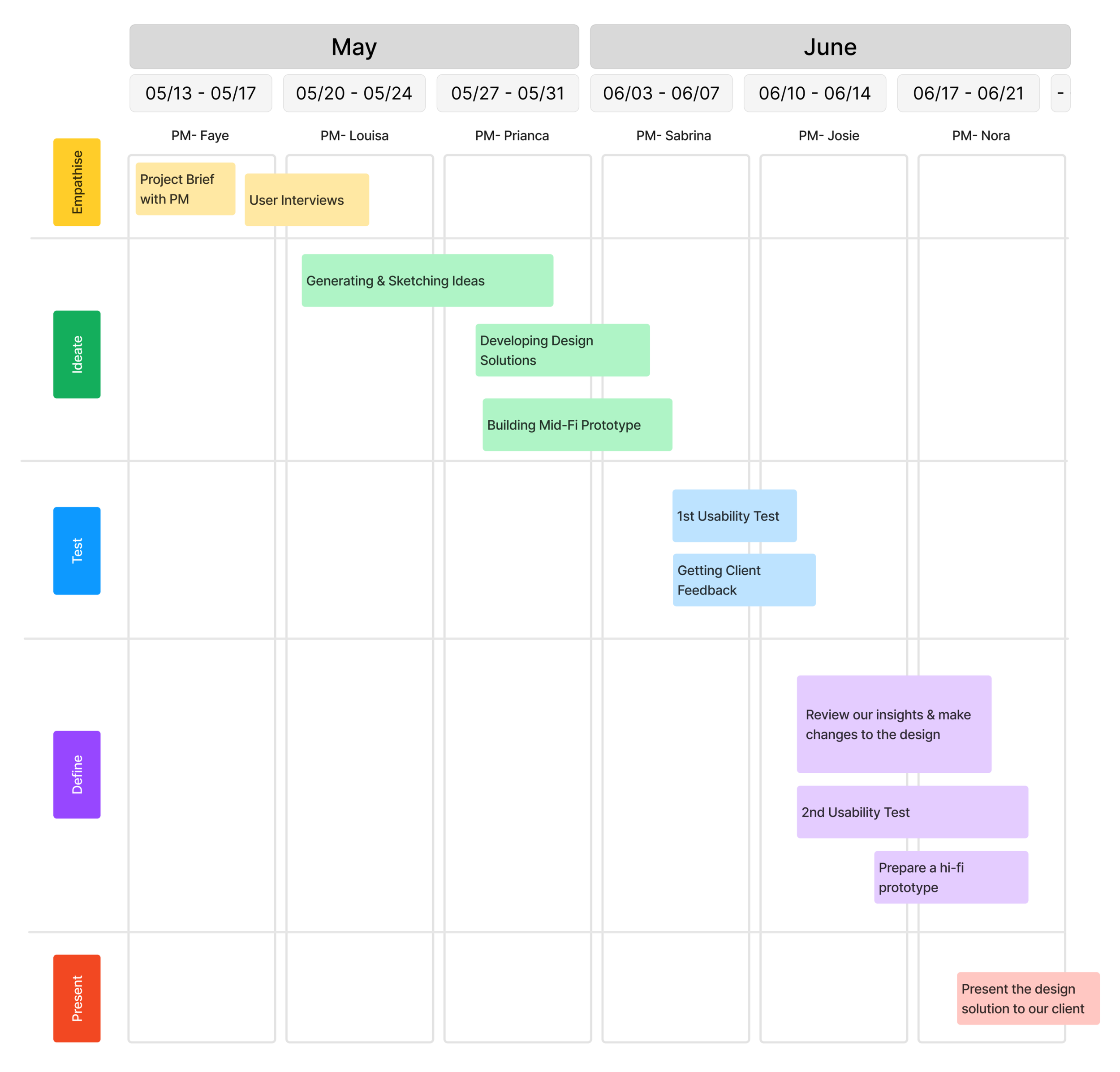
Project Roadmap
Lead Product Designer, User Researcher
My Role
Team of 6 including designers, researchers & developers
My Team
In Collaboration with
How We Started the Project
Key takeaways from client call & interview
Project Goal:
To develop a mobile app that allows patients to book appointments quickly and easily.
Users should be able to:
Search medical specialties
Choose location (Including virtual)
Choose a doctor & service
Select from available dates & time slots
See detailed information on costs
Use “One-Tap” to book an appointment
Be able to book an appointment under a minute
Target Users: Patients aged 18-50
Current Challenges:
Long booking time: Each clinic in Harley Hospital's network has its own appointment webpage, making it challenging for patients to book appointments.
Lack of digital identity: The brand currently has no online presence, as everything is offline.
User Interviews
"I get so frustrated with the long hold times and waiting periods when scheduling appointments; it just wastes my time and leaves me annoyed by the end of the process."
"Without real-time information, it's hard to discuss and schedule appointments because the receptionists are always rushing to the next caller. I often end up with inconvenient times, which only adds to my frustration."
"It's hard to know which specialist to see or what each specialty means. I need accessible, non-medical language to help me choose the right appointment."
User Surveys
Key Insights
of our participants have a bad experience when booking a doctors appointment
of our participants have refrained from booking an appointment because of their past experience
This has resulted in our users feeling
Key User Pain Points
Problem Statement
Our Problem Statement
The current booking process is overly complex, with each clinic using its own system.
This leaves users feeling confused, uneasy, and stressed when trying to schedule appointments with doctors. It's crucial to develop a user-friendly app that consolidates all clinic locations and doctors, making appointment booking effortless for users.
The Challenge
How might we simplify the appointment booking process at Harley Hospital to create a seamless and efficient experience that consolidates clinic locations and doctors?
User Persona
Empathy Map
My team and I collaboratively created an empathy map based on insights from our user interviews. This exercise helped us dive deeper into users' emotions and frustrations, providing a clearer understanding of their challenges with the current appointment booking experience.
User Flow
As a team, we facilitated a workshop to create a simple user flow further and ensure alignment on the user journey.
Concept Ideation
As a team, we came together to brainstorm concepts after gaining a deep understanding of user needs and pain points, and aligning with the business objectives. This collaborative ideation process was driven by empathy for our users, ensuring that our solutions addressed both their challenges and the strategic goals of the business.
After Ideation, we analysed this concept & we realised that:
1) Booking an appointment isn’t quick and easy because there isn’t a clear call to action
2) The design did not account for the organisation's requirement for "subscription tiers."
3) Allowing users to book a new appointment by selecting from categories like location, specialty, and symptoms may cause confusion, as these options lack clear direction and information
However, we realized that the "one-tap booking system" has significant potential
It would greatly streamline the process, allowing users to book follow-up appointments quickly and efficiently. By eliminating multiple steps and reducing complexity, this system could save users valuable time and minimise the frustration often associated with traditional appointment scheduling.
Benefits of One-Tap Booking:
Our Product Goals
Before creating the Mid-Fi wireframes, we first ensured that our product goals were fully aligned with the overall business objectives. This step was crucial to guarantee that the design not only met user needs but also supported key business priorities.
The app objectives
The Principles
Our Success Metrics
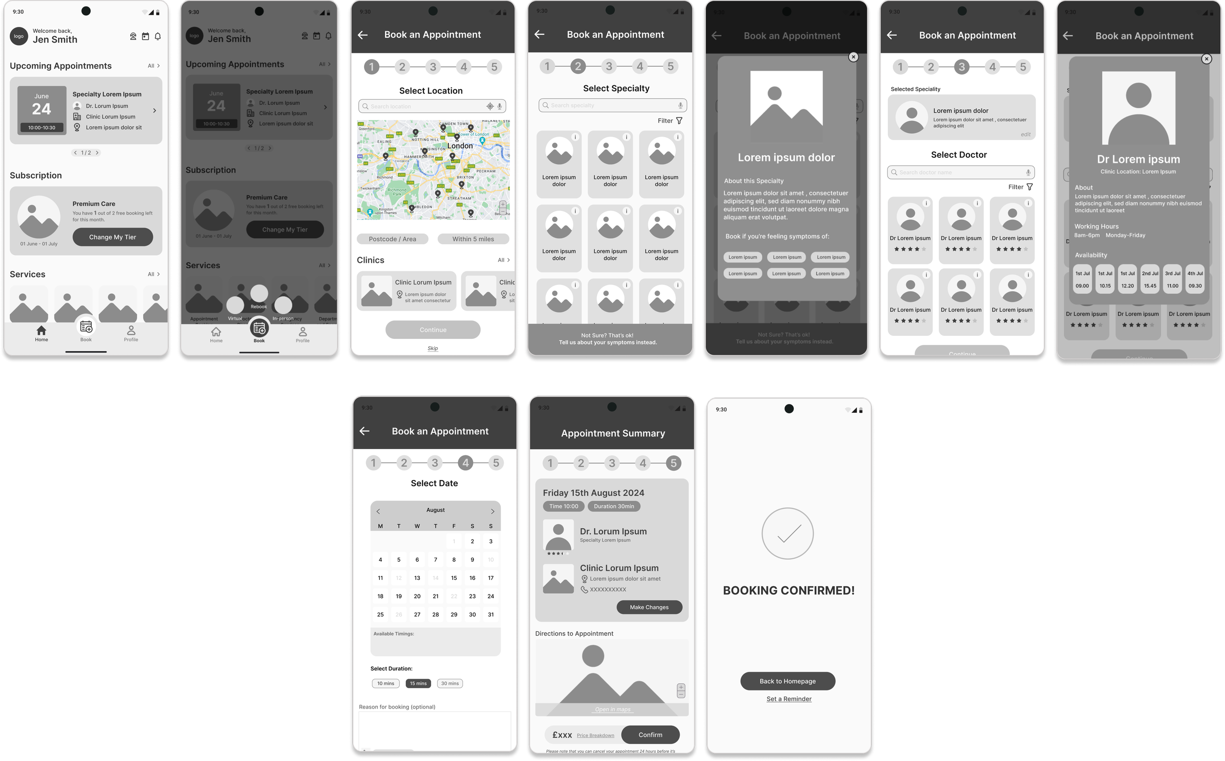
Mid-Fi Wireframes
My team and I brainstormed ideas and collaboratively created wireframes for the booking flow and one-tap feature, utilising the previously defined elements.
Booking Flow
One Tap Booking
1st Usability Test Insights
My Insights
Insight 1
“The booking process felt too restrictive, as it required selecting the location as the first step. I would prefer if the first step focused on choosing the doctor for flexibility ”
The booking flow felt restrictive due to a lack of options.
Our booking flow currently follows the sequence: location → specialty → doctor.
However, this order presents several issues, as many users prefer to begin by selecting a specialty or doctor first. Starting with location feels counterintuitive, as it is often the least important factor in their decision-making. Users are primarily focused on finding the right doctor for the appropriate check-up, with location being a secondary consideration.
Insight 2
Booking time & rebooking time was too long
The average time for users to book an appointment was 3.28 minutes, which significantly exceeds the project requirement of completing the booking process within one minute.
Insight 3
Users want a flexible appointment management
Most users were unhappy with the cancellation process, as it lacked a simple way to cancel appointments. With many users having unpredictable schedules, a more flexible cancellation & rebook option is essential.
Insight 1
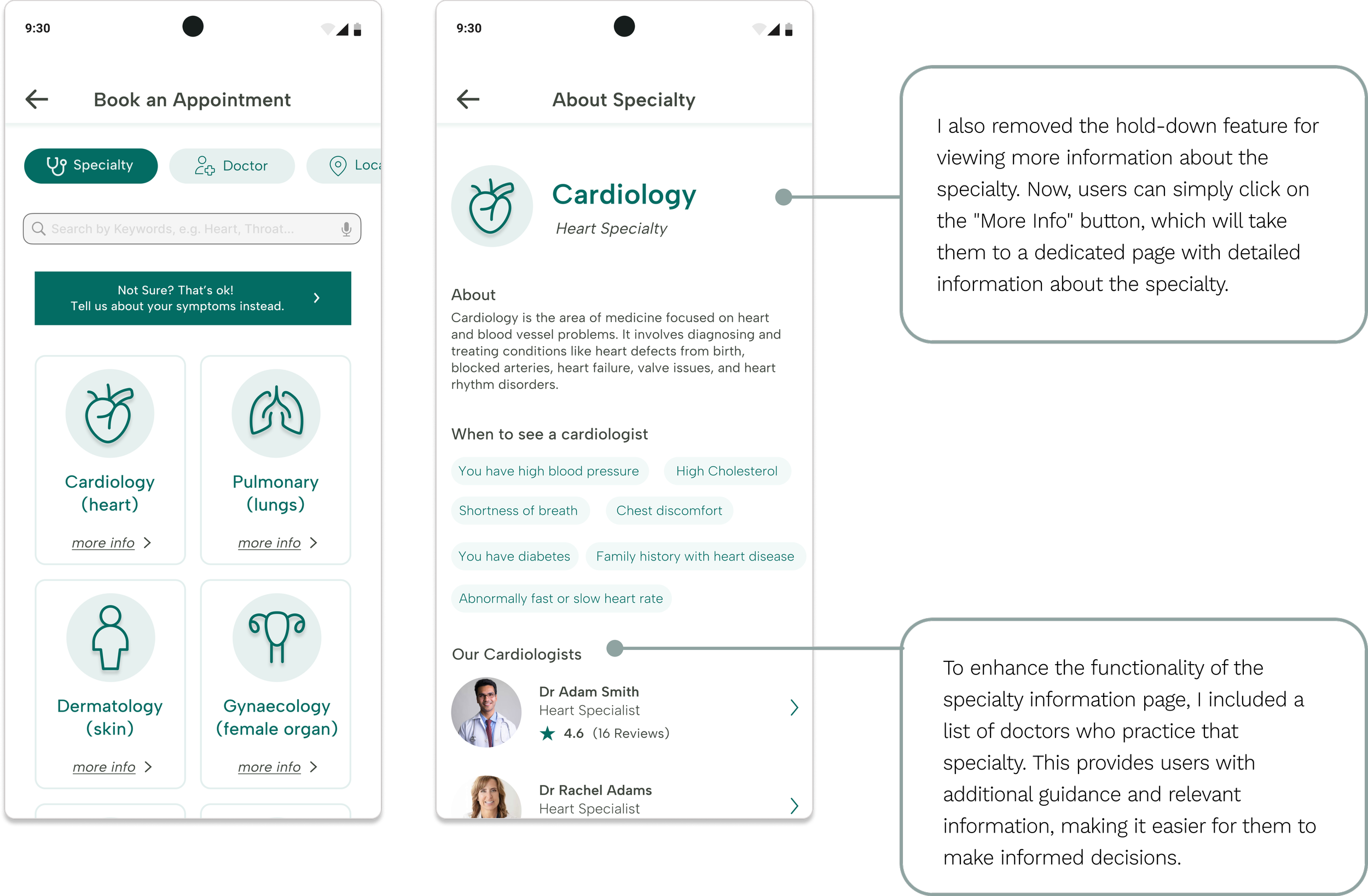
The booking flow felt restrictive due to a lack of options
The Current Issue:
MOT
Possible Solutions:
Old Design
The first version of my wireframe lacks flexibility as it requires users to start with selecting a location. However, I observed that users have different preferences, with location being just one of several possible starting points.
To create a more inclusive and flexible experience, it's important to offer multiple starting points for booking an appointment, catering to the diverse needs of users.
New Design
Insight 2
How might we reduce the booking time?
The Current Issue:
New Design
Insight 3
User wants flexible appointment management
Client Call
My team and I arranged a meeting with the client to address this issue. By presenting our data, we successfully convinced the client and stakeholders to implement a more flexible cancellation system. We emphasised that making the app user-friendly would encourage repeat usage, ultimately boosting user retention.
Possible Solutions
New Cancelation System
After exploring various solutions, we determined that prioritising the user's best interests was crucial. Implementing a system of limited free cancellations based on the user's subscription level emerged as the most logical and fair approach.
Other Changes
Date/Time Selection & Appointment Summary
Old Design
New Design
Based on user testing feedback, I redesigned the date and time selection. Users found the calendar picker unintuitive, so I introduced a simplified horizontal scroll option for selecting dates and times. The calendar view remains available for users who want to quickly navigate to other months.
I also streamlined the appointment summary page, reducing visual clutter and removing any redundant information.
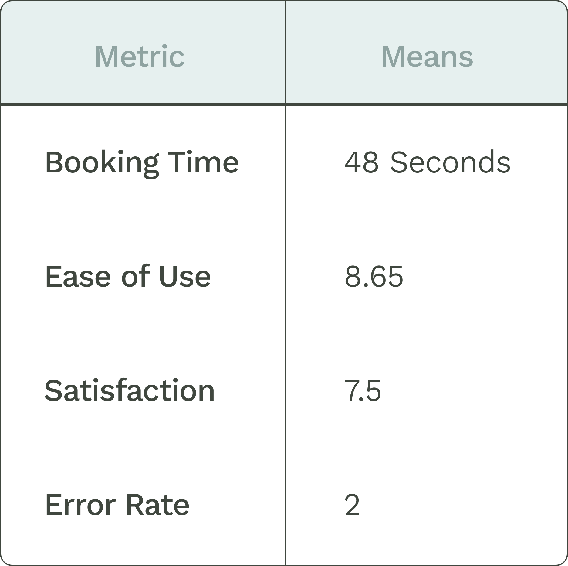
2nd Usability Test
Success Metrics Defined:
The results from the second usability test reveal a mix of successes and areas for improvement. While certain aspects performed well, there are clear opportunities to enhance both the ease of use and overall user experience. Addressing these challenges will be key to creating a more seamless and intuitive interaction for users
“It’s very clean and intuitive. There are just a few minor tweaks needed to reach the booking process, but overall, it’s clear and direct.”
More Adjustments
Final Wireframes
UI & Branding
Our Goal
To strike the right balance between visually appealing design elements and maintaining usability & to ensure consistency with the visual style and brand identity
Our Design Principles
The Design System
Reflection
The foundation of great design is accessibility
Collaborating on this project as a team, I quickly realised how essential user input truly is.
Through teamwork, we were able to explore diverse perspectives, which allowed us to better empathise with users who have a wide range of needs. This collective approach highlighted the importance of considering accessibility from the start.
An inclusive design that caters to all users is fundamental. Without thorough user research, there can be no meaningful design. Understanding the users’ challenges, preferences, and requirements is the cornerstone of creating solutions that work for everyone.
Curious to learn more about this project and my journey along the way? Let’s Chat!


