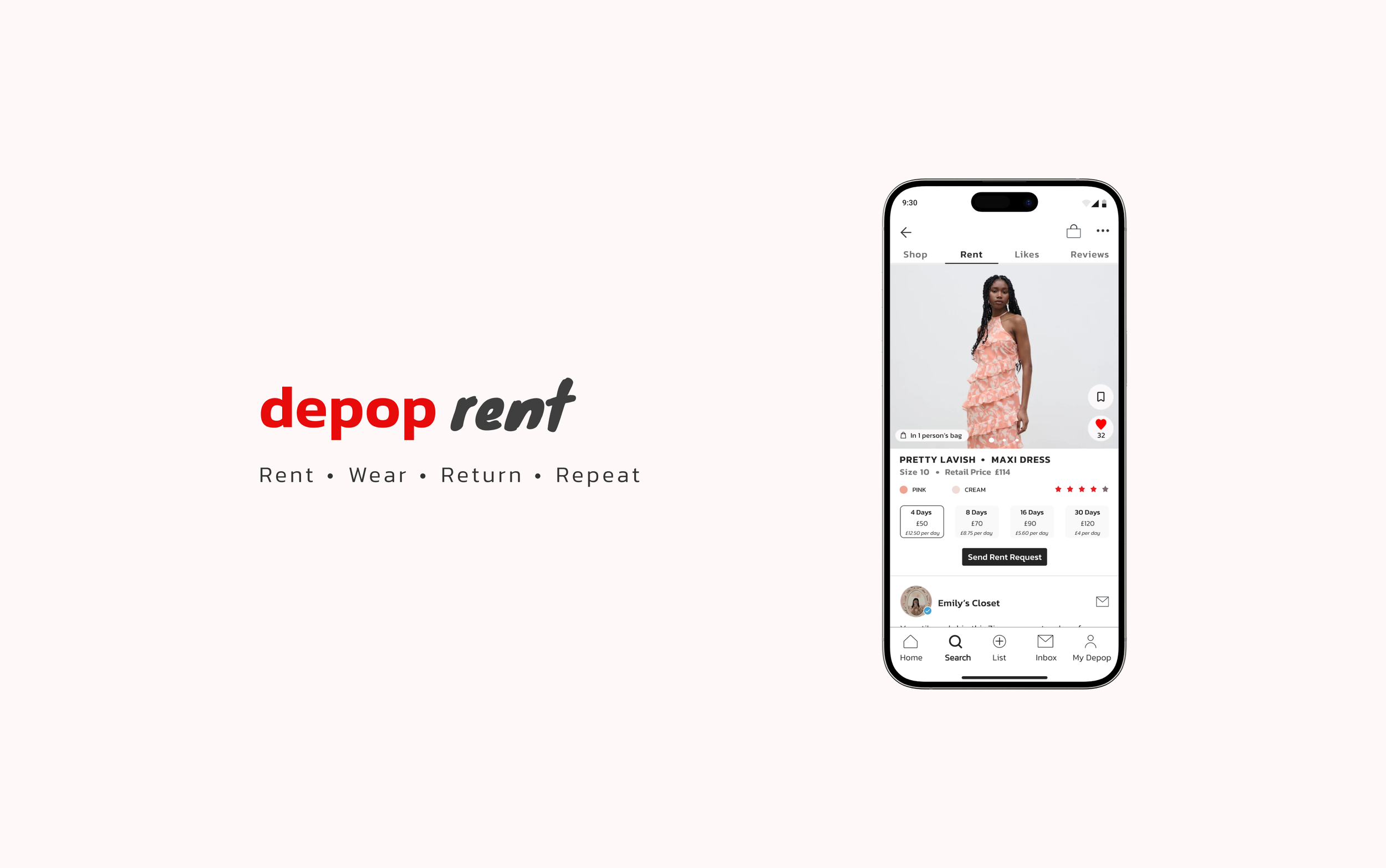
About This Project
A UX project aimed at supporting Depop's sustainability efforts by creating a more user-friendly and eco-conscious experience on the platform.
The Problem
Many consumers struggle with the dilemma of purchasing expensive items that they will only wear once.
What I accomplished
In this project, I tackled the challenge by designing solutions that make fashion rentals more accessible and appealing on Depop, aligning perfectly with the platform’s sustainability goals.
Why I started this project
Before transitioning into UX design, I spent three years working as a junior fashion designer.
During that time, I witnessed first-hand the staggering amount of waste generated by the industry, particularly from single-use clothing.
This experience deeply impacted me and fuelled my passion for sustainability.
The clothing rental market holds immense potential but has yet to fully take off.
Quick Links
Type
End to End Mobile App
Role
Research & UX/UI
Timeline
2 Weeks
About Depop
Research
Depop is a global fashion marketplace resale platform that allows users to buy & sell preloved second hand clothing
Depop has surged in popularity among Millennials and Gen Z, establishing itself as a go-to platform for purchasing trendy second-hand clothing
It also combines elements of social media with e-commerce, creating a community-driven marketplace. Users can follow sellers, like items, and engage with each other, creating a sense of connection and discovery.
Depop’s Goal & Message
To combat wasteful fashion by reducing excessive consumerism that is dangerously growing every year -
Their strategy not only benefits the environment but also supports a more ethical and conscious approach to our choices.
Facts About the Fashion Industry
Accounts for 10% of the global carbon emission
2nd largest fresh water polluter
2nd largest consumer of water
2700 litres of water needed to produce one t-shirt
7500 litres of water to produce a single pair of jeans (this is 7 years worth of drinking water for an average adult)
As of now, we are purchasing 60% more clothing compared to the year 2000.
According to the Royal Waste Service, this has resulted in 97 million tons of waste generated from leftover textiles in the year 2023.
This number is predicted to increase every year due to mass consumerism.
Source- BBC Earth & Modefica
Why Clothing Donations Don’t Make a Difference
Only 10 to 30% of second-hand donations to charity shops are actually resold in-store (CQ, 2023). The rest end up in landfills, polluting our planet even more.
Most clothes made from synthetic fibers take 200 years to decompose in landfills, while natural fibres like cotton decompose in just five months (Business Waste, 2023).
Circular Economy is the Future of Fashion
What can we do?
Rewear, Rewear, Rewear!
On average, we should aim to wear each piece of clothing at least 30 times before discarding it.
However, today, people tend to wear their clothes only about 7 times before getting rid of it.
The rise of fast fashion has led consumers to buy more but wear their purchases less frequently.
These seemingly small actions collectively result in a staggering 18.6 million tons of clothing being thrown away globally every year (Project Cece, 2022)
Small Changes Make a Difference
The environmental footprint of reusing textiles is reduced by a factor of 70, even when accounting for global exports and transportation emissions (EuRic, 2023).
Purchasing second-hand items is a great option, but the next best thing you can do is to re-wear and lend your clothes as much as possible.
Renting just one or two items each year might not seem like much, but it can significantly help the environment by reducing water usage by 24%, energy consumption by 6%, and carbon emissions by 3%.
Why Rent?
The Rise of “Wear it Once” Culture
The "wear it once" culture is particularly prevalent for special occasions, as many people prefer not to be seen in the same outfit twice.
A 2019 survey by Barnardo's Charity revealed that 10 million wedding guest outfits were purchased that year with the intention of being worn only once.
This practice not only harms the environment but also burdens individuals with the cost of buying expensive outfits for single-use.
In the United Kingdom alone, people spent £2.2 billion on outfits intended to be worn only once in 2021 (Refinery29, 2021). In 2020, Vice conducted a survey of 10,000 individuals aged 18-24, asking if they discard clothes after wearing them just once. I wasn’t shocked when 23% of respondents said yes.
This number has likely increased since the survey was conducted.
Many Millennials and Gen Z, including myself, wear outfits only once for events due to social media, where people often hesitate to re-wear outfits soon after being photographed.
The Current Online Clothing Rental Market
By Rotation
The app ByRotation is surging in popularity as it addresses the issue of users wearing expensive outfits only once for an event.
Instead of re-selling these items at a loss, users can profit by renting them out to those in need. In addition to benefiting financially, users also contribute to environmental sustainability by promoting the reuse of clothing and accessories.
Industry analysts predict that popular clothing rental apps like Nuuly, Rent the Runway, and Armorie will see their sales almost double from $1.6 billion in 2023 to $2.3 billion by 2028.
(CBS News, 2023)
By Rotation has secured $3 million in seed funding to further develop its app and concept (Business of Fashion, 2022)
I want to design & introduce the same rental feature that enhances Depop’s commitment to sustainability and circular fashion by enabling users to lease clothing and accessories to other fellow Depop users.
I also see this as a good business proposition as the clothing rental industry is set to grow to 2.3 billion by 2028 (Vogue Business, 2023).
Opportunity For Depop
There is an immense potential within this market segment that Depop is still yet to explore.
Define
Lets Begin the Design Process
My Strategy:
To begin this design process, I am using the double diamond approach. This method will enable me to thoroughly understand the users' goals, needs, and pain points by exploring and addressing the challenges they encounter. My objective is to create a practical design solution that completely integrates with the existing brand.
The Current Version of the App
The current version of the app is highly successful in terms of its functionality. I analysed several features to identify elements that could enhance the rental aspect of the app.
The following was identified:
Homepage
Personalised homepage according to the users preferred style
Shows popular sellers
Image collage of a variety of items buyers might be interested in
Search option categorised i.e. trousers, tops, bags etc
Seller Page
Shows the last time the account was active
Verified blue tick
Seller Reviews
Message Seller
Shows popular sellers
Advanced Filter- size, colour, condition, proximity etc.
Short Item description with the current condition of the item
Competitor Analysis
I decided to analyse direct competitors in the clothing rental market to understand their interactions and rental opportunities.
Peer-to-peer rental apps like By Rotation and Tulerie require users to send a request to the lender about the item they wish to rent. Only after the lender approves the request is the user charged.
Platforms such as Hurr are a combination of peer to peer, brands and retailers.
Additionally, Selfridges has recently introduced a rental option for some of their luxury items, allowing users to choose rental periods of 2, 8, 16, or 30 days. Tulerie offers a similar range of rental durations.
Effective communication & trust between users and lenders is essential for this model, which is why both parties must be verified before they can lend or rent items.
User Interviews
I undertook 10 interviews with Depop users to delve into their perspectives on clothing rental. I interviewed a combination of sellers and buyers. My objective was to uncover their motivations for opting to rent clothes, explore their past experiences with renting, and identify any potential challenges or frustrations they encountered.
Upon analysing the data, a common trend emerged:
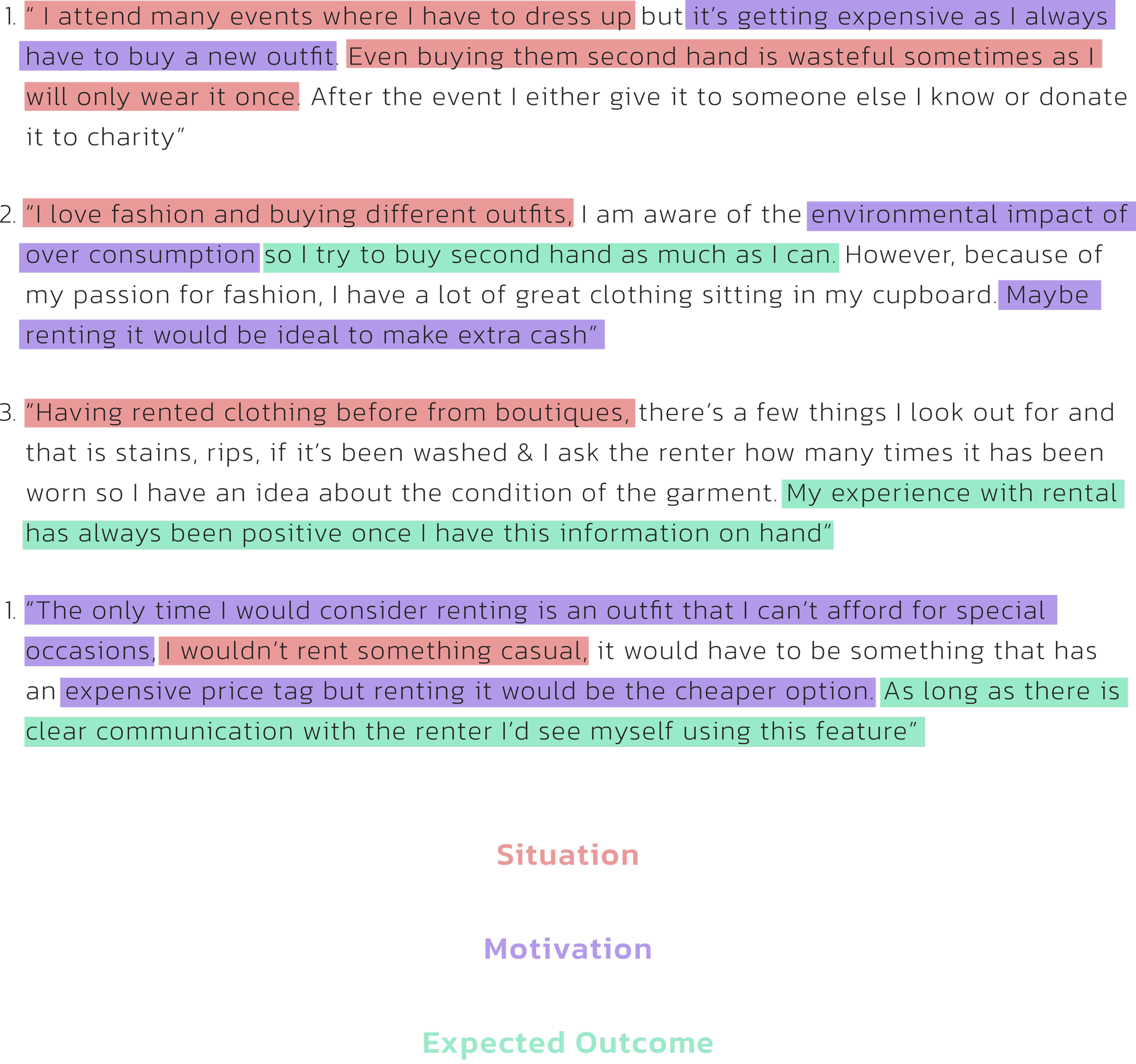
Depop users would prefer to rent expensive clothing and accessories for special occasions like weddings or parties.
They seek a means of achieving an upscale look without breaking the bank, preferring not to invest in full-priced items they might wear only once.
However, the lenders were interested in renting but concerned that they might not receive their item back in the same condition as before.
I proceeded with the below problem statement:
Have an easy communication feature for both side
Create an infographic that visually explains the rental procedures
Ensure lenders are verified before they can rent their outfits
Ensure that both parties are verified before they can rent an item or want to rent their item
Provide a FAQ section to address common questions or concerns
User Interview Insights
These concerns show how having a clear process, communication and policy for lost or damaged in place for both users and sellers to follow is essential to create a smooth user experience with the renting feature.
JTDB Framework
After conducting user interviews, I used the JTBD framework to understand their decisions and desired outcome
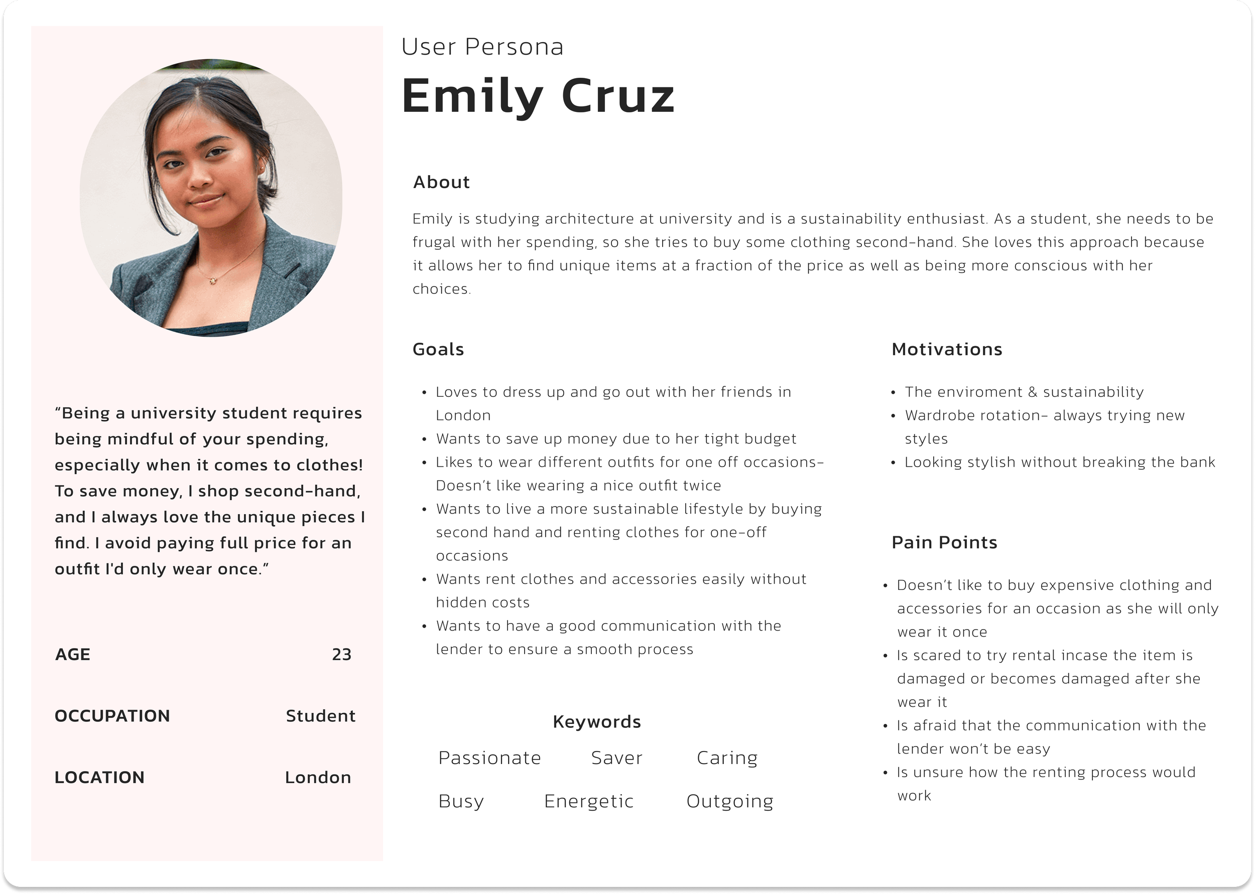
After understanding Emily's needs, goals, and pain points, I refined a problem statement to serve as the structure for the design phase. This problem statement focuses on addressing the trust issues Emily has with rental procedures.
By tackling these issues early in the user journey, we can create a smooth and trustworthy experience for Emily.
Have an informed policy in place for more transparency
Meet Emily
I created a user persona of a potential Depop user based on online research, user interviews, and my understanding of people I knew who used Depop. While not entirely research-based, this persona was a valuable reference throughout my project, helping to guide my decisions and insights.
Emily’s Journey Map
I created a user journey map to better understand the persona's experience with renting. This allowed me to identify any issues they might encounter and the causes behind them. By understanding these pain points, I can help improve their rental journey with Depop.
Problem Statement
Emily wants to start renting outfits for special occasions rather than buying them at full price.
However, she is hesitant to rent from an online platform due to uncertainty about the procedures and policies.
Emily values good communication with the lender, as it helps her make an informed decision before renting a garment.
“How Might We” Questions
After building the problem statement, I formulated three "How Might We" (HMW) questions to delve deeper into the pain points and explore potential solutions.
1) How might we help Emily feel confident and informed about renting outfits for special occasions?
Provide a detailed explanation of the return and refund process
Mandatory fields where lender has to list the size, measurements & condition of the item
Just as lenders have reviews, Emily should also be reviewed since she will be returning the items. This would help other lenders feel more confident about lending their items. This concept is similar to the Uber app, where drivers can also rate passengers.
3) How might we explain the rental procedures in a clear and simple way for both parties?
Be clear about any extra costs incase the item comes back damaged i.e.- damage protection or security deposit
Create a comprehensive rental agreement that outlines all the necessary information
After exploring the three HMW questions in depth, it became clear that both the user and the lender need to build a good rapport for the renting process to work smoothly and transparently.
Key Elements to Achieve:
Allowing users to have reviews just like lenders, so other lenders feel more confident
Providing a detailed section on how the rental process works, with graphics
Including a damage protection fee
Implementing a rental agreement
Offering a clear description of the item, including its rental reviews and condition
The User Flow
Emily can send a rent request to the lender before she gets charges
I then created a user flow to visualise the user journey, including both happy and unhappy paths. This allowed me to gain a deeper understanding of the users' goals and frustrations.
2) How might we build a good rapport between Emily and lender?
Design
Lo-Fi Sketches
After assessing the HMW questions and analysing the user flow, I sketched out the necessary screens for the user journey.
I incorporated all identified elements into each screen before creating my mid-fidelity prototype in Figma and further exploring detailed requirements.
Navigation from homepage to a rental item
Mid-Fi Wireframes
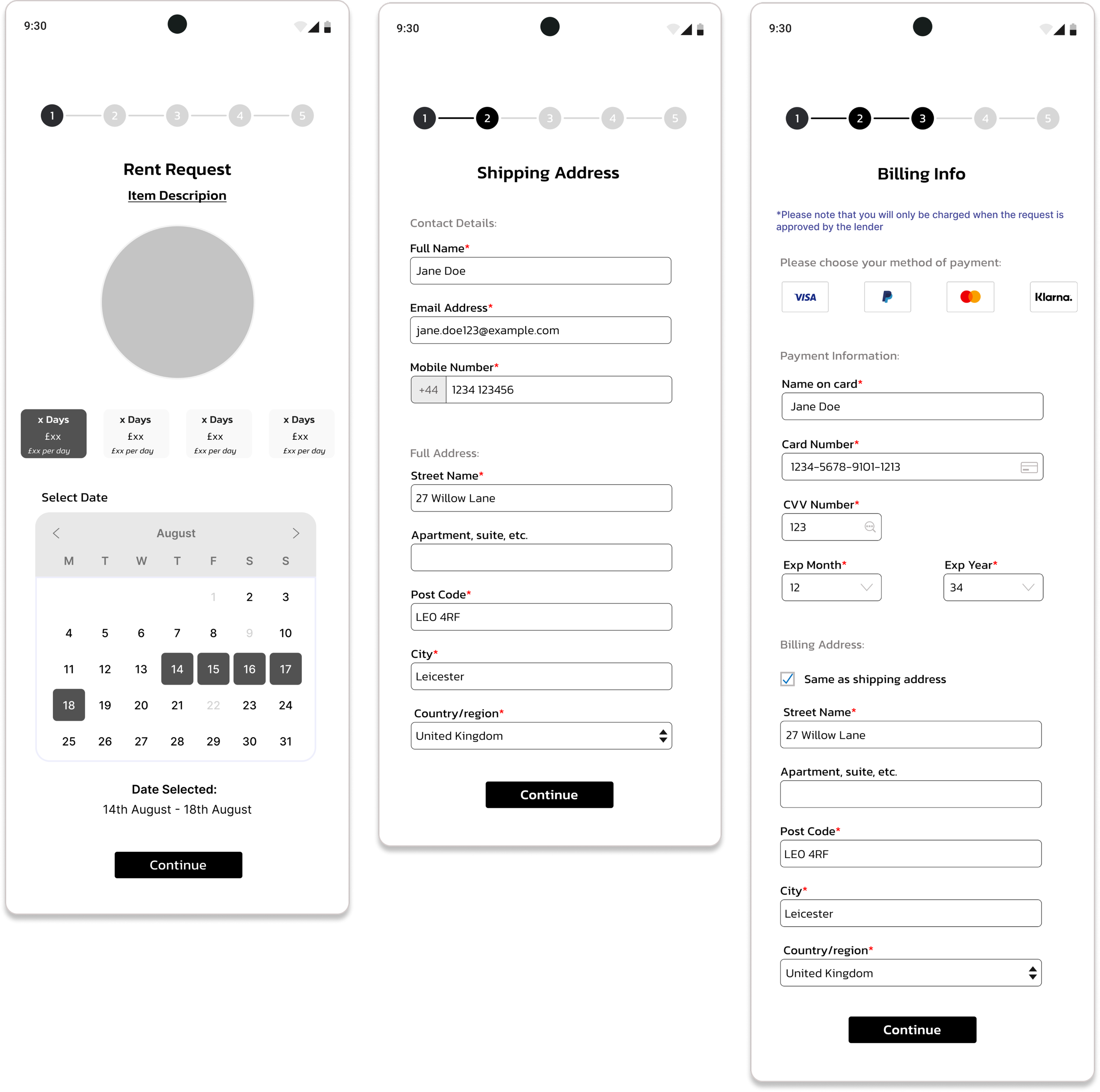
Below are the mid-fidelity wireframes I created after gathering insights from user interviews, designed with the Depop interface and user experience in mind. With my research established, I aimed to streamline the booking process and empathise with the Depop users.
Key features included are:
Item Reviews- Allows users to leave reviews on items they've rented & helps potential renters make informed decisions based on previous
Detailed item description- Including size, brand & reviews from previous rentals
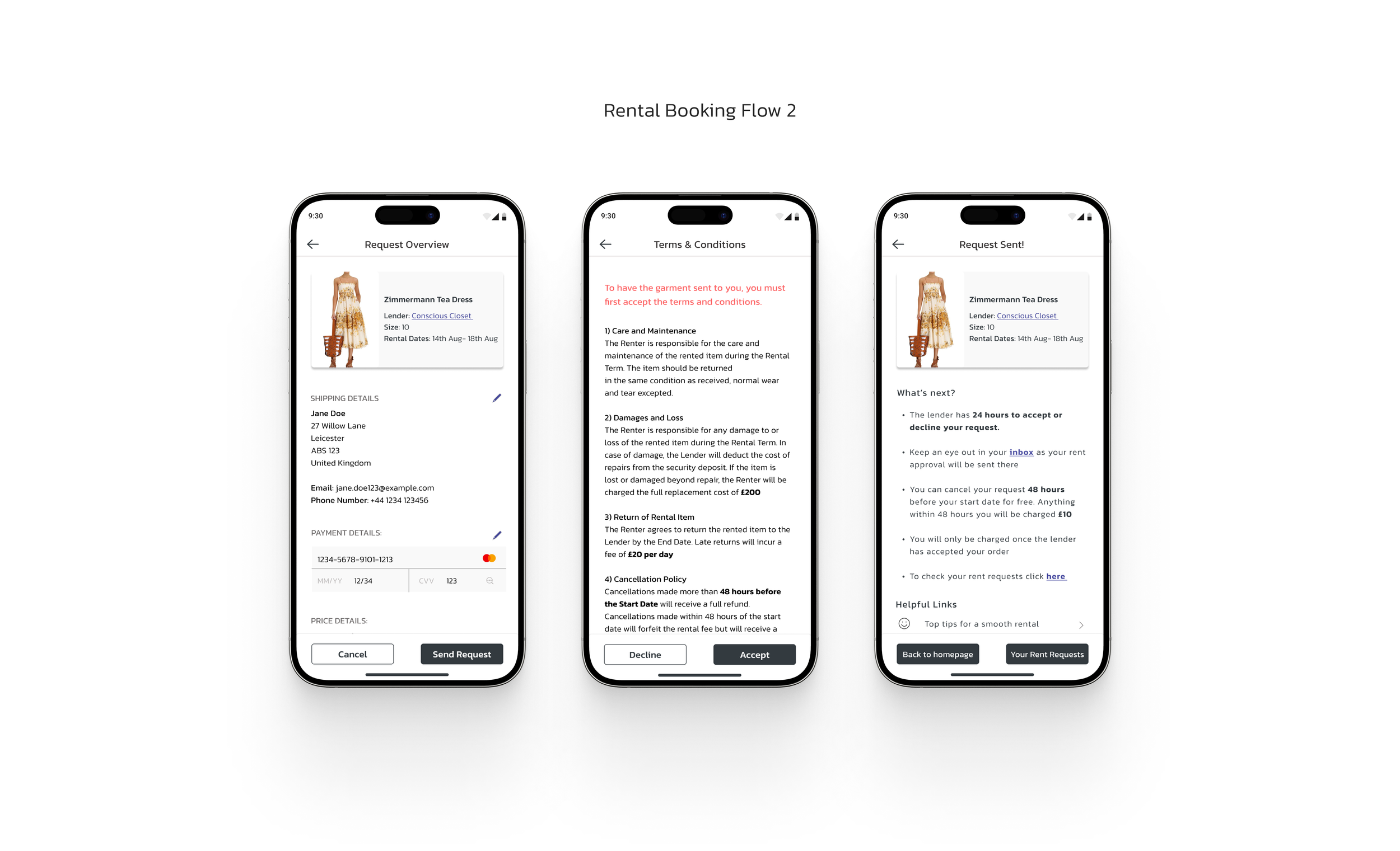
A rental agreement (t&c) that covers scenarios of damage or theft.
Options to rent for 4, 8, 16, or 30 days for flexibility
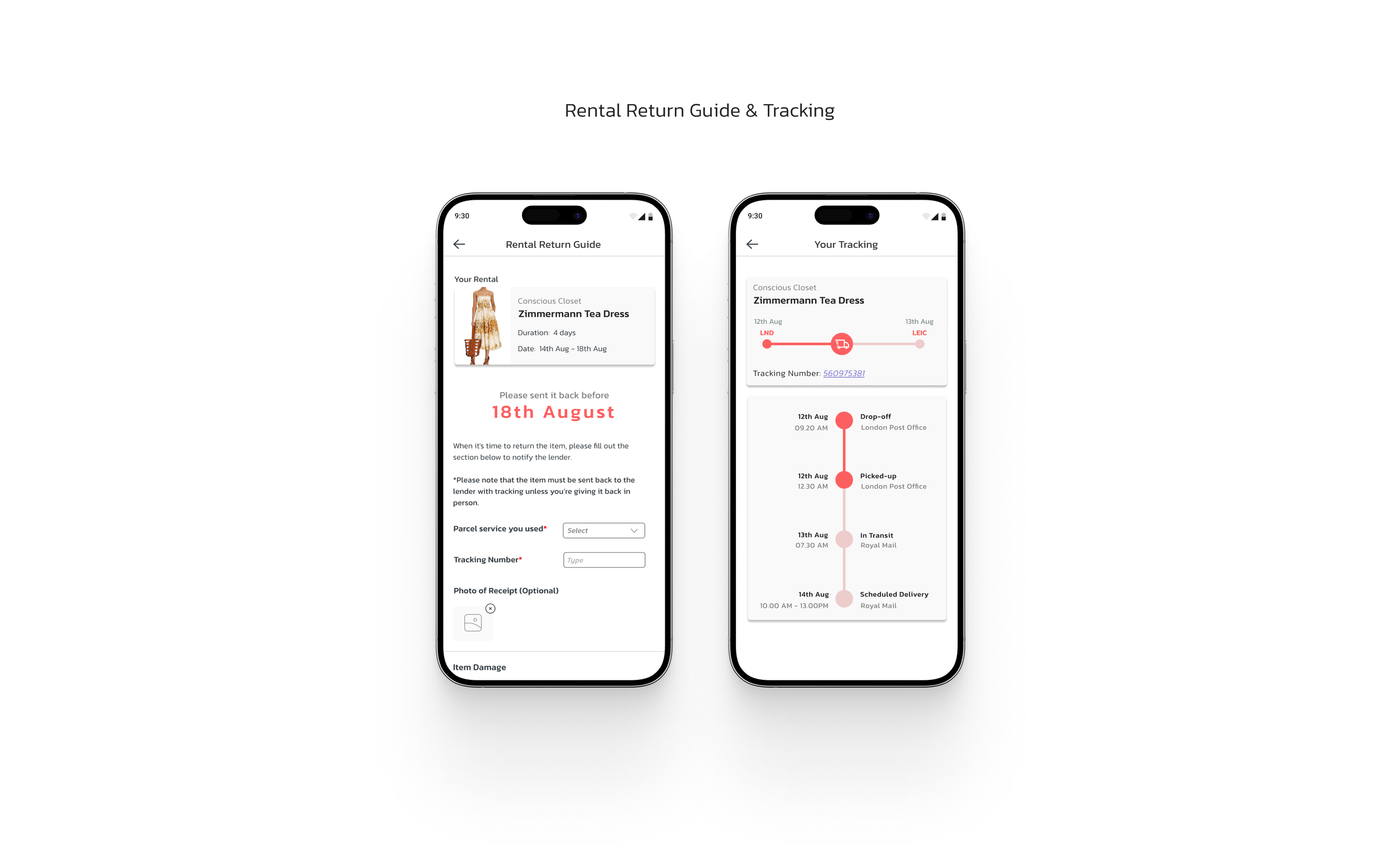
Tracking system once item has been sent out
Rental Request Flow
Below are additional features designed to enhance the user journey beyond the core rental booking flow:
1) Rental Return Guide
Ensures transparency between the user and the lender
Users fill out the guide when returning the item, including tracking details and the shipping company used
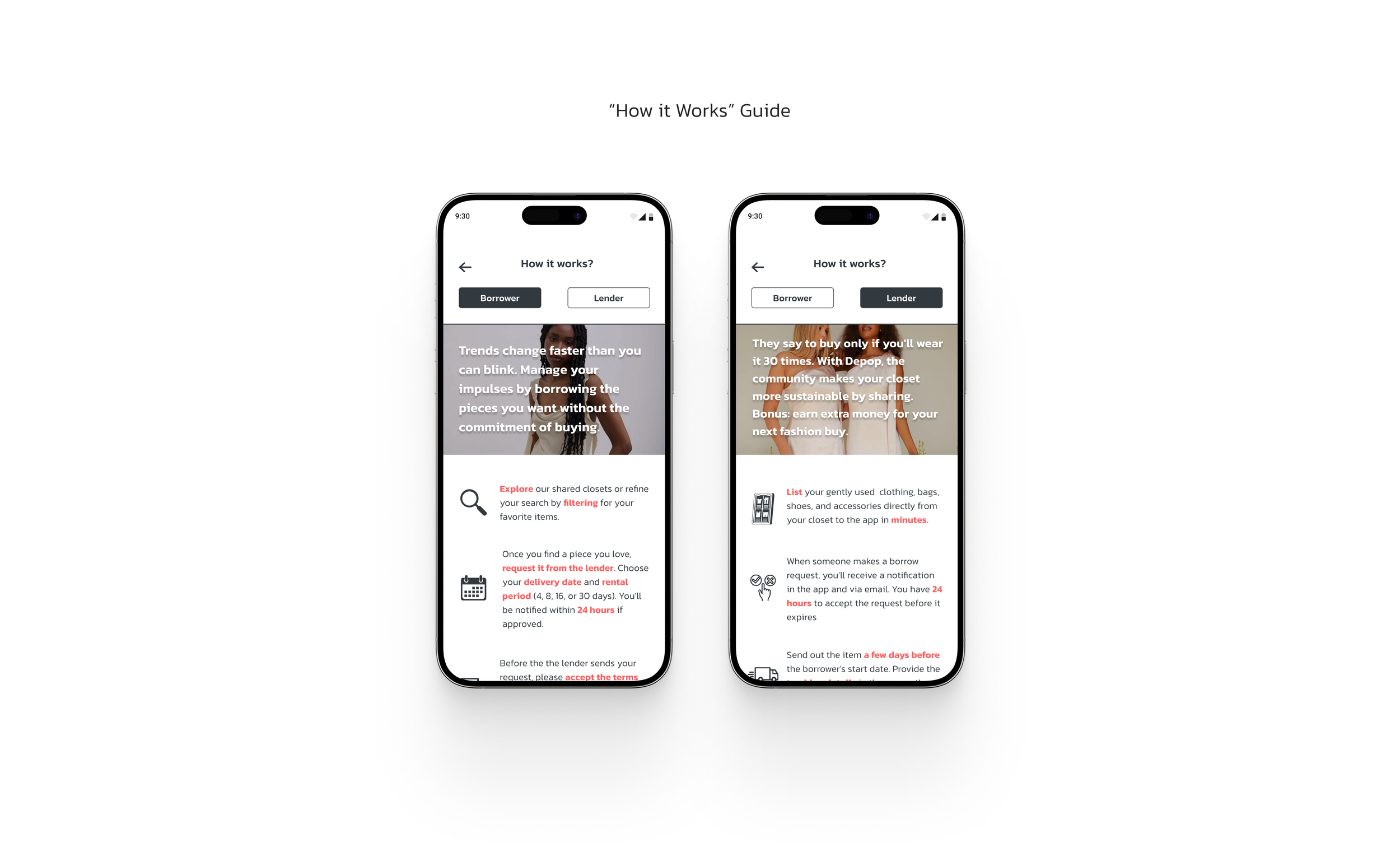
2) "How it Works" Infographics
Provides detailed information for both lenders and users
Ensures all parties are well-informed about the rental process before using the feature
3) Rental Chat
Separates messages related to rentals from purchase-related messages
Simplifies communication for users, making it easier to keep track of rental-specific conversations
These features aim to enhance transparency, provide clear information, and streamline communication, ensuring a smooth and informed rental experience for all users.
Testing
I conducted five in-person usability tests with Depop’s target audience, each lasting approximately 10 minutes. The primary goal of these tests was to evaluate the ease and effectiveness of the garment rental process.
Success Metrics:
My Insights
Analyse the Ease of Renting a Garment
Assess if users can navigate the interface smoothly to find and rent a garment
Identify any potential obstacles or points of confusion in the rental flow
Determine the overall user satisfaction with the rental process
Evaluate the Availability of Information
Verify if users could easily find answers to their questions during the garment request process, such as:
Size and fit details
Colour options and appearance.
Lender reliability and trustworthiness (e.g., reviews and ratings)
Ensure that users feel well-informed and confident in their rental decisions
1st Usability Test
Assess User Trust in the Feature
Determine if users feel secure and confident using the rental feature
Identify any concerns or hesitations regarding the reliability of the platform and the transparency of transactions.
Gauge the perceived credibility and safety of the rental process, including payment security and item return procedures
“I found the navigation a bit confusing because I wasn’t sure how to access the rental page to explore more options”
1) Homepage Confusion
Users found the homepage slightly confusing because the purchase and rental features were mixed together
2) Difficulty in Searching Rental Items
Users struggled to find items based on their preferences, such as size, colour, and occasion
3) The rental listing order
Users were interested in the cost of the rental feature before they had a chance to analyse the description and reviews
4) Lack of Item Information in Rental Request Booking Flow
Some users felt that item information was missing as they progressed through the booking flow, leading to uncertainty about renting the item
Iterations
Old Design
New Design
Insight 1
Homepage Confusion
Users found the homepage slightly confusing because the purchase and rental features were mixed together
How Might We….
Design the homepage to clearly differentiate between purchase and rental features, ensuring a seamless and intuitive user experience?
Identifying Moments of Truth
Upon reviewing my user flow, I realised that I failed to create clearly separated sections for buying and renting.
This oversight resulted in a homepage that combined both features, leading to user confusion during testing.
Old Design
1) Clear Segmentation
Create distinct sections on the homepage to clearly differentiate between purchase and rental options
The Current Issue
Lack of Item Information in Rental Request Booking Flow
Some users felt that item information was missing as they progressed through the booking flow, leading to uncertainty about renting the item
Old Design
Old Design
Old Design
Solutions
2) Intuitive Navigation
Add intuitive navigation tabs or buttons to allow users to easily switch between purchase and rental sections
Insight 2
Difficulty in Searching Rental Items
Users struggled to find items based on their preferences, such as size, colour, and occasion
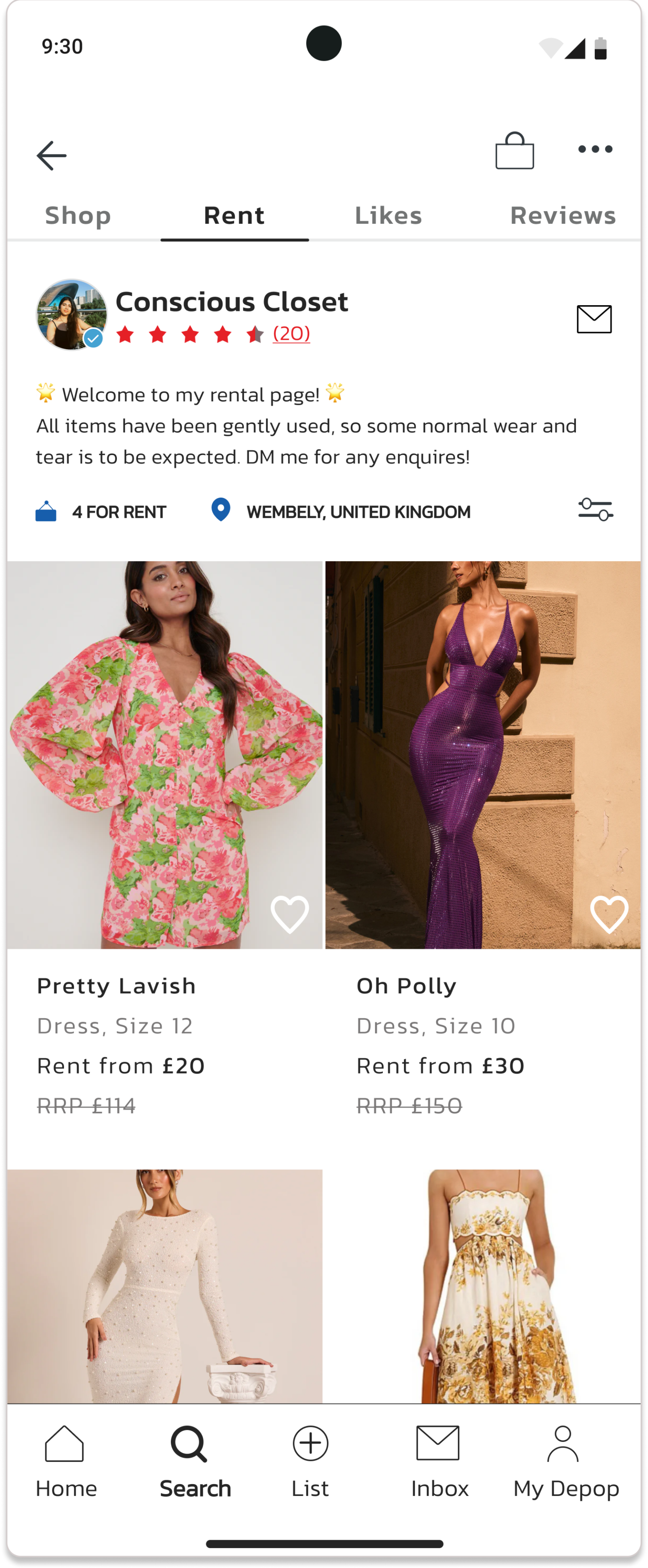
Enhanced Rental Search Feature
1) Include rental categories such as occasions, garment types, and nearby rentals to give users a starting point
2) Include advanced filters for users to easily search by size, colour, occasion, and other relevant criteria
The rental listing order
Users were interested in the cost of the rental feature before they had a chance to analyse the description and reviews
After encountering this problem, I decided to experiment with quick sketches to find a way to present prices alongside images without taking up too much space.
Additionally, I conducted market research on retail apps to understand how they effectively display their prices.
I decided to change the information hierarchy of this page to align with user interests, as my observations indicated that users prefer seeing key details first such as price to help them make quicker decisions.
Based on further market research on clothing item descriptions, I also added the colour of the item to provide extra information.
Add an overview section that displays a summary of all the decisions the user has made during the booking flow
Include tips on how users can achieve a smooth rental process
New Design
1) “How It Works” Guide
2) Rental Return Guide
New Design
3) Users Current & Past Rentals
Old Design
Solutions
How Might We….
How might we simplify the search for rental items to make it easier for users to find options based on their preferences, such as size, colour, and occasion?
Insight 3
My observation during user testing....
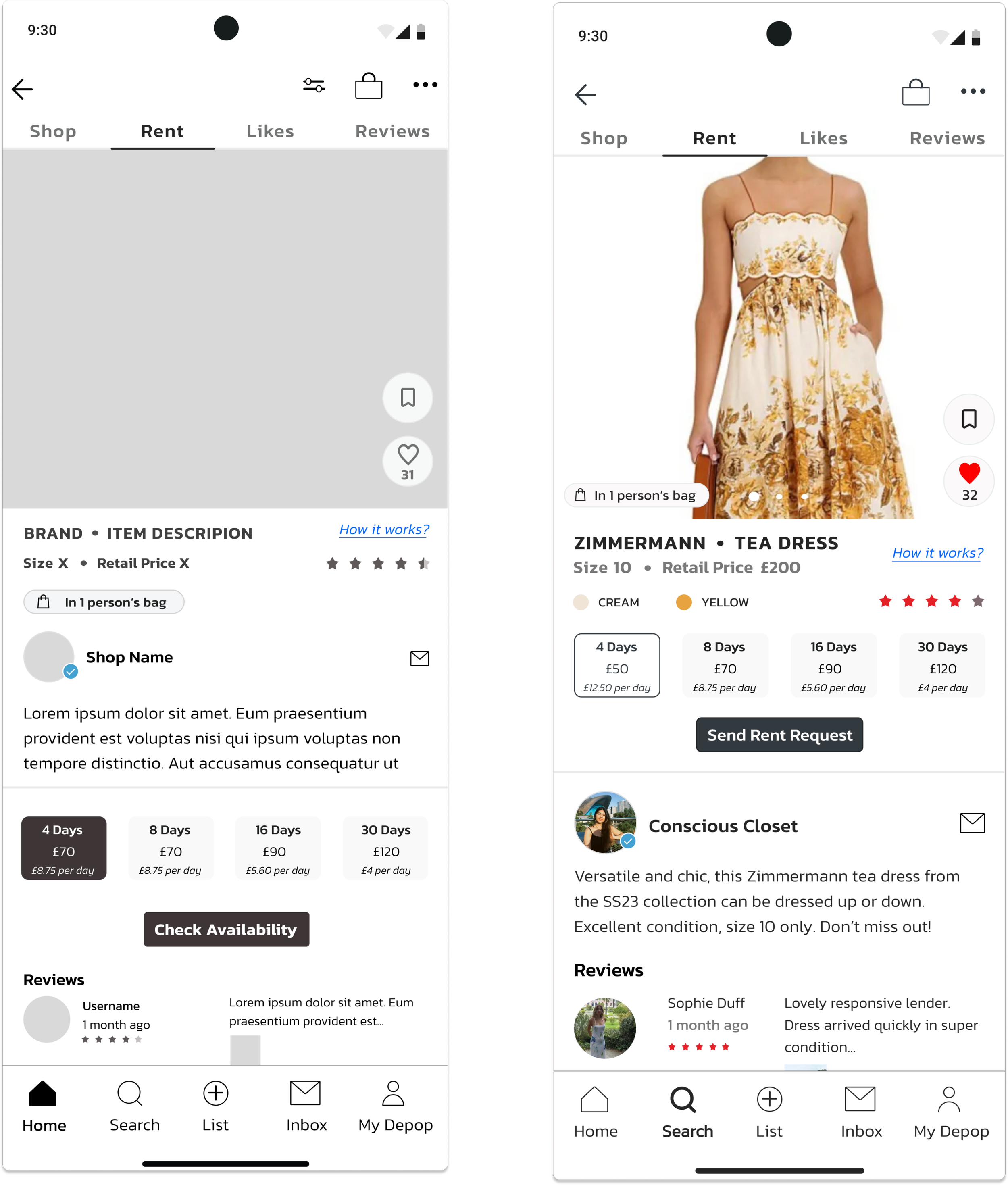
During user testing, I observed that users prioritised the price range of rental items before exploring other details. It was clear that price was the key factor driving their interest.
Solution
To make pricing more visible for users, the information hierarchy of the item page should be restructured & redesigned
New Design
Old Design
Other Changes
New Design
Insight 4
As users progressed through the booking flow, they felt uncertain about booking the item due to the lack of information about the garment as they moved through the screens.
Additionally, some users noted the absence of helpful advice about renting a garment, which would have made them feel more informed and confident about their decision
Solution
New Design
After experimenting and redesigning the rental page, I developed a solution that clearly displays the brand name, size, starting rental price, and retail price.
This allows users to easily see how much money they can save by renting.
The first version of my design lacked detailed information about the garment users wanted to rent. During usability testing, I observed that this caused users to second-guess their choices, as they often forgot the dates they had selected by the time they reached the payment stage.
In my new design, I included the user's selections as they progressed through the screens which can also be edited.
This helps them feel more secure and confident about their choices by the time they reach the payment stage.
I also added an option for users to choose whether they want the item to be posted to them or collected in person.
To better guide users through their rental journey, I have designed an information tab that is quick and easy to read.
Additionally, I've incorporated tips in a different colour throughout the booking process to assist users in making informed decisions.
New Design
I redesigned the "How It Works" page to give it a more contemporary look and make it easier to understand.
Adding images and graphics helps to better connect with users.
During usability testing, I identified an opportunity for users to report any damage on the rental return form.
In my user interviews, lenders expressed concerns about potential damage, so incorporating this feature will ensure transparency between users and lenders.
Small design changes, such as enlarging sections, have made the interface more accessible and inclusive. During usability testing, users mentioned that the buttons were too small, so this adjustment addresses their concerns.
Additionally, I included the rental price for users' records to provide clear and useful information.
2nd Usability Test & Iterations
1st Usability Test
2nd Usability Test
“This experience was much smoother than last time.
It was much easier to tell which items you can buy and which you can rent. I’d really like to check out the rental options by location and nearby rentals—I think I’d use those features often.”
My Insights:
Users could easily navigate from homepage to the rental section
Users found the homepage to be more organized, making navigation easier compared to the first usability test. They were able to locate the rental section of the app without any difficulty.
Providing a wider range of rental options offered users a strong starting point
By adding extra sections such as brands, occasions, and locations for users to choose from, we provided a variety of options and a solid starting point for their rental journey. However, users expressed a desire to explore these options in greater depth, particularly the "rentals near you" feature, which captured their interest the most.
Upfront prices improved transparency and simplified navigation
Displaying prices without requiring users to click on each style made the entire process more transparent and streamlined. Navigation was quicker, as users didn't need to click on individual styles to see the prices.
Improved visibility and guidance increased user confidence
During the first usability test, I noticed that users lacked trust in the booking flow because they couldn’t see the item they were booking, which made them feel less confident about proceeding. In the second usability test, after adding advice on how to rent for a smoother experience and displaying the item on each screen, users reported feeling more secure and confident about moving forward.
Improvements
After conducting the second usability test, I've identified an area for enhancing the user journey. The improvement is as follows:
Old Design
Separating the images and text resulted in a neater, less cluttered layout. After gathering feedback from a few users, the response to the new design was overwhelmingly positive—they appreciated being able to clearly see the text.
Some users mentioned that the text under the occasions and categories was difficult to see. My next step will be to experiment with the layout and explore ways to better integrate images with the text
New Design
UI & Branding
When it came time to upgrade my Mid-Fi design to Hi-Fi, I conducted thorough research into Depop's current branding, focusing on the app’s colour scheme and typography. Since the rental feature I was designing would be integrated into the existing interface, it was crucial for the new feature to smoothly align with the overall aesthetic and flow of the current version of the app.
Final Wireframes
Prototype Video
Next Steps…
Research potential business opportunities to join and leverage Depop’s platform for renting out fashion styles. While Selfridges has successfully implemented this concept, there is still significant room for growth and expansion.
Dive deeper into the "rent by location" and "rentals near you" features, as users have shown significant interest in them.
Next, I'll design an interface that caters to lenders, as I've mostly focused on the renters' perspective. User interviews and testing revealed that lenders have significant concerns about lending items to strangers, so addressing their needs is crucial. I plan to explore features for listing rental items, managing acceptance and rejection of requests, and tracking their items.
I want to dig deeper into the relationship between users and lenders and figure out how to build trust, especially since many won’t have reviews at first. Finding ways to make people feel secure about renting or lending their items is key to making this idea work. This could mean reinforcing verified profiles or adding insurance options to ease any worries and get more people on board.
My Reflection
A Good Design is Always Evolving
During the research and design stage, I realised that design isn’t linear—it’s always changing based on findings, and it’s never going to be perfect, which is okay.
The key is continuously understanding users’ needs and pain points, which is what makes a design truly impactful.
Throughout this project, I’ve embraced challenges and enjoyed the process of problem-solving and uncovering ways to make users' lives easier through design.
Knowing that my work can make a difference keeps me motivated and growing as a UX designer.
Now, here’s to the next challenges and projects!


