SSENSE - WEBSITE REDESIGN
This project takes a fresh look at SSENSE, using usability testing to identify issues with the current website and redesign it to create a more user-friendly shopping experience.
OVERVIEW
About SSENSE:
Ssense is a global online marketplace offering a curated selection of luxury fashion, blending established and emerging brands across womenswear, menswear, and kidswear. Recognised as a leader in the luxury e-commerce space, Ssense garners nearly 100 million monthly page views, underscoring its worldwide influence. As of November 2024, the platform reported an impressive annual revenue of $750 million.
The Challenge
As a passionate fashion-tech enthusiast, I deeply admire Ssense’s vision of making luxury fashion accessible on a global scale. However, I see significant opportunities to enhance the website’s functionality and design to further improve user experience, boost user retention, and ultimately drive higher revenue for the platform.
The Solution:
I conducted a usability test compliant with the Common Industry Format (CIF) methodology and redesigned the SSENSE website after identifying key usability issues and providing recommendations to improve the ease of searching for and purchasing clothing items.
My Role:
UI/UX Designer, UX Researcher
Project Duration:
4 Weeks
Tools:
Figma
METHODOLOGY
I adhered to the CIF methodology for the usability test, using standard metrics to evaluate efficiency, effectiveness, and user satisfaction.
Additionally, I incorporated qualitative elements such as the think-aloud protocol, emotional interpretation, and post-test interviews. These methods provided valuable insights, allowing me to effectively achieve my research objectives.
MARKET RESEARCH
Heuristic Evaluation:
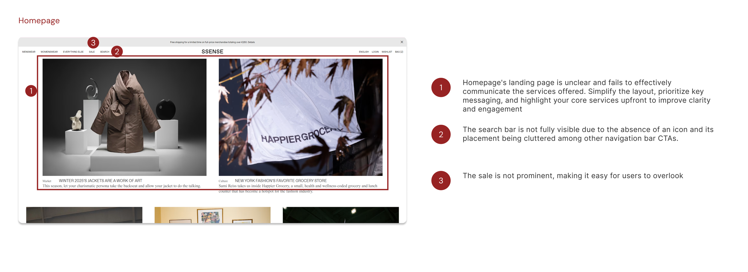
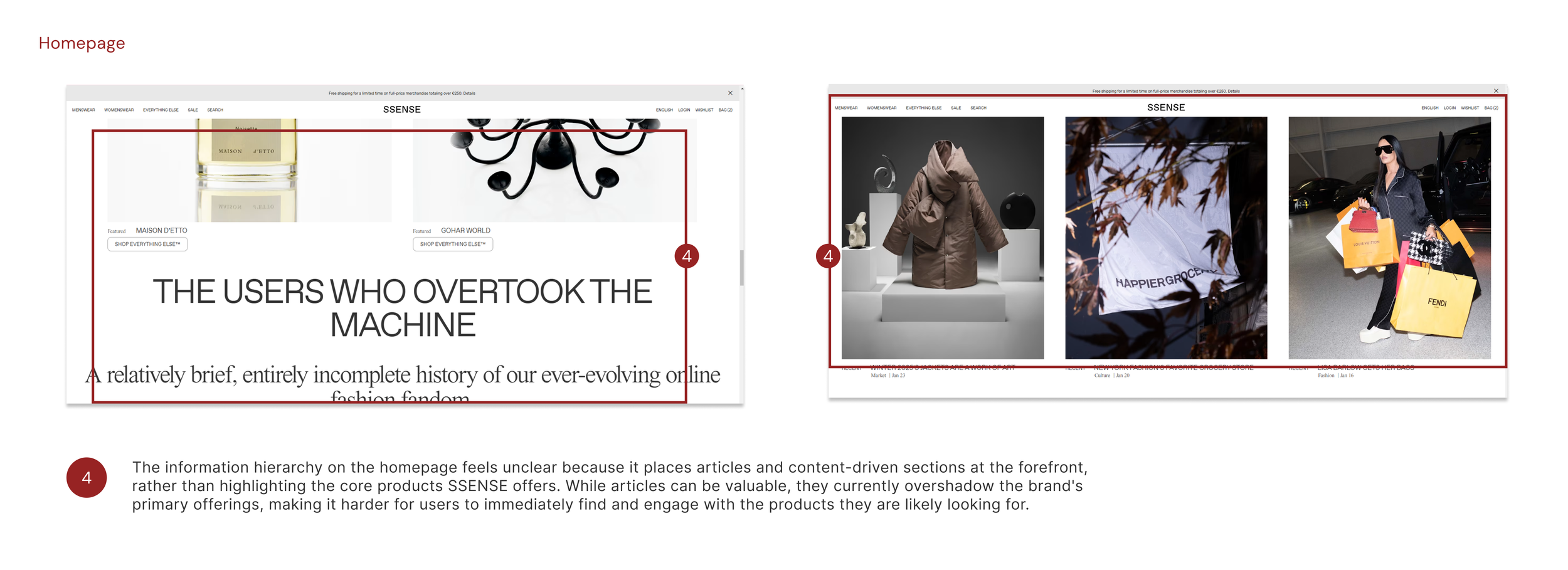
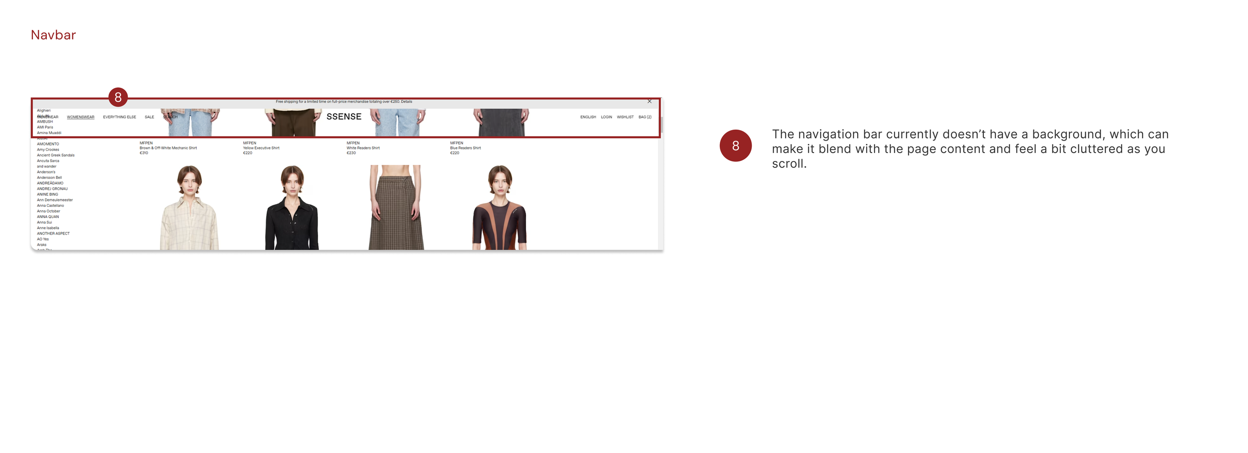
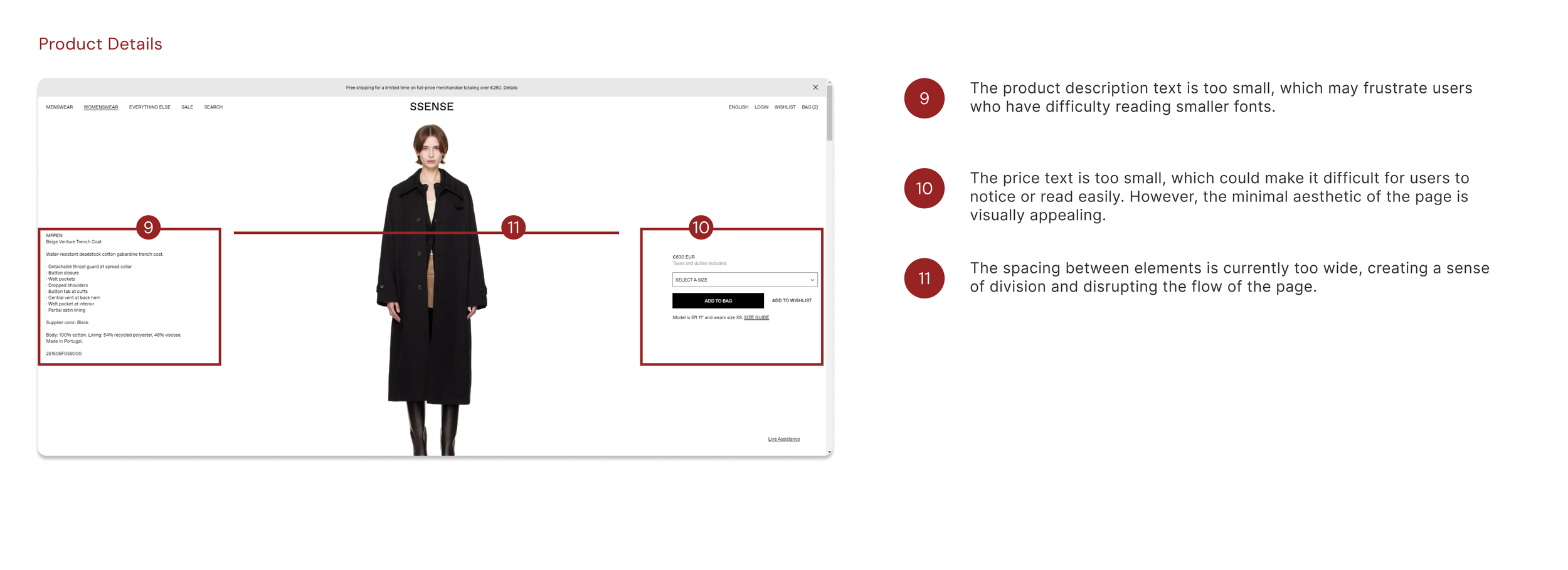
Before conducting usability testing, I performed a heuristic evaluation of the current SSENSE website to identify usability issues. My focus was on the core functionality, layout, UI components, and content that users interact with when browsing for clothing and adding items to their shopping bag.
This evaluation proved valuable in uncovering potential usability challenges users might face during testing. It allowed me to empathise with their experience while also approaching the site from a designer’s perspective.
Online User Reviews
I gathered recent online reviews about the website to evaluate its current state, and the feedback highlighted several concerns. A notable number of users expressed dissatisfaction with various aspects of their experience, with some even going as far as to describe it as 'the worst online experience.
User Testing & Insights
To identify the root of the problem, I conducted a usability test comparing the Ssense website with a direct competitor, Farfetch. During the test, I measured key metrics including time on task, user satisfaction, and error rate.
The testing script was as follows:
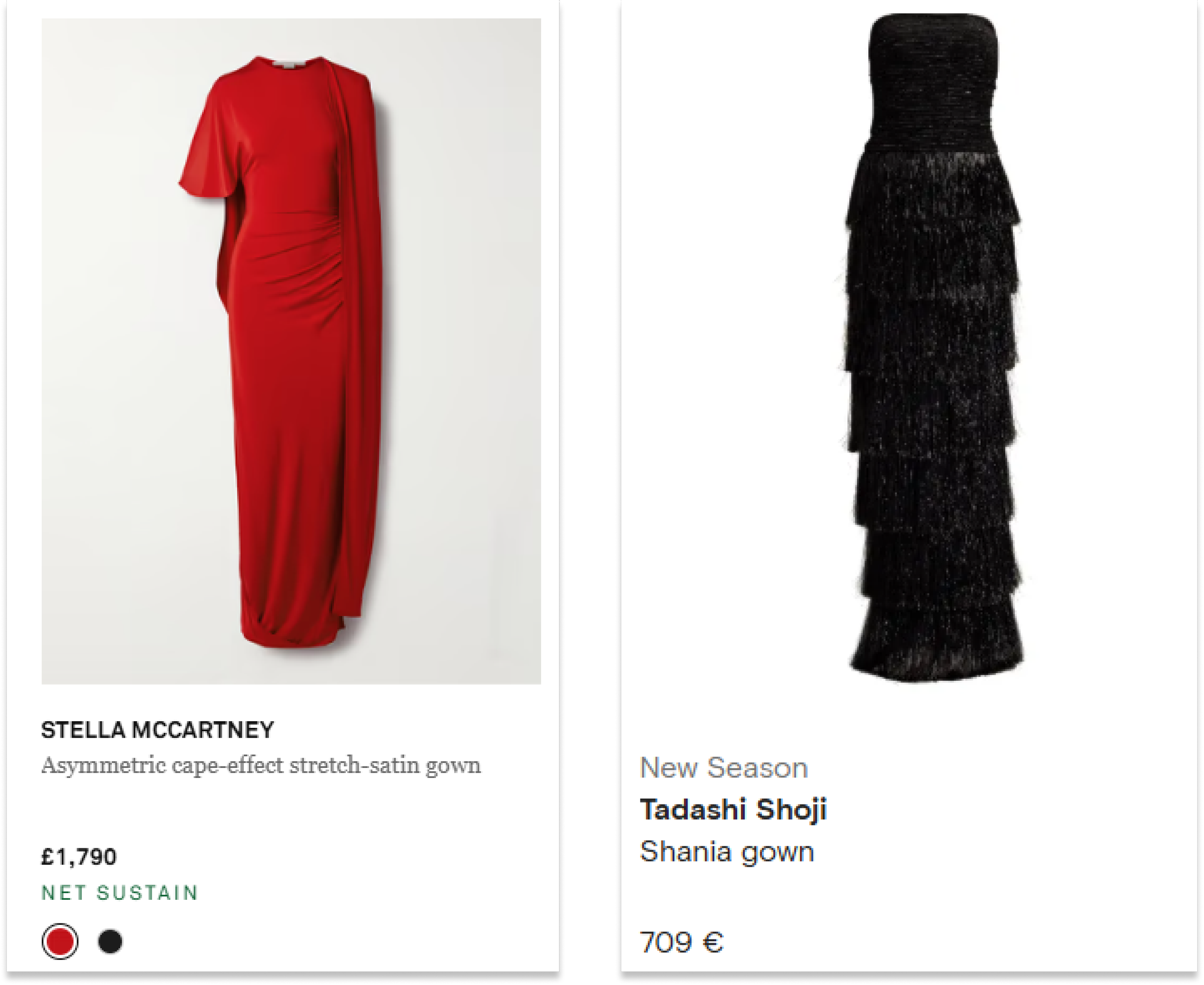
"Starting from the homepage, navigate the site to find a black Alexander McQueen evening dress. Select any dress, choose any size, and add it to your basket."
During the test, I encouraged users to think aloud and share their thoughts freely. I also ensured they understood that the focus was on evaluating the website, not their performance.
Notable Quotes:
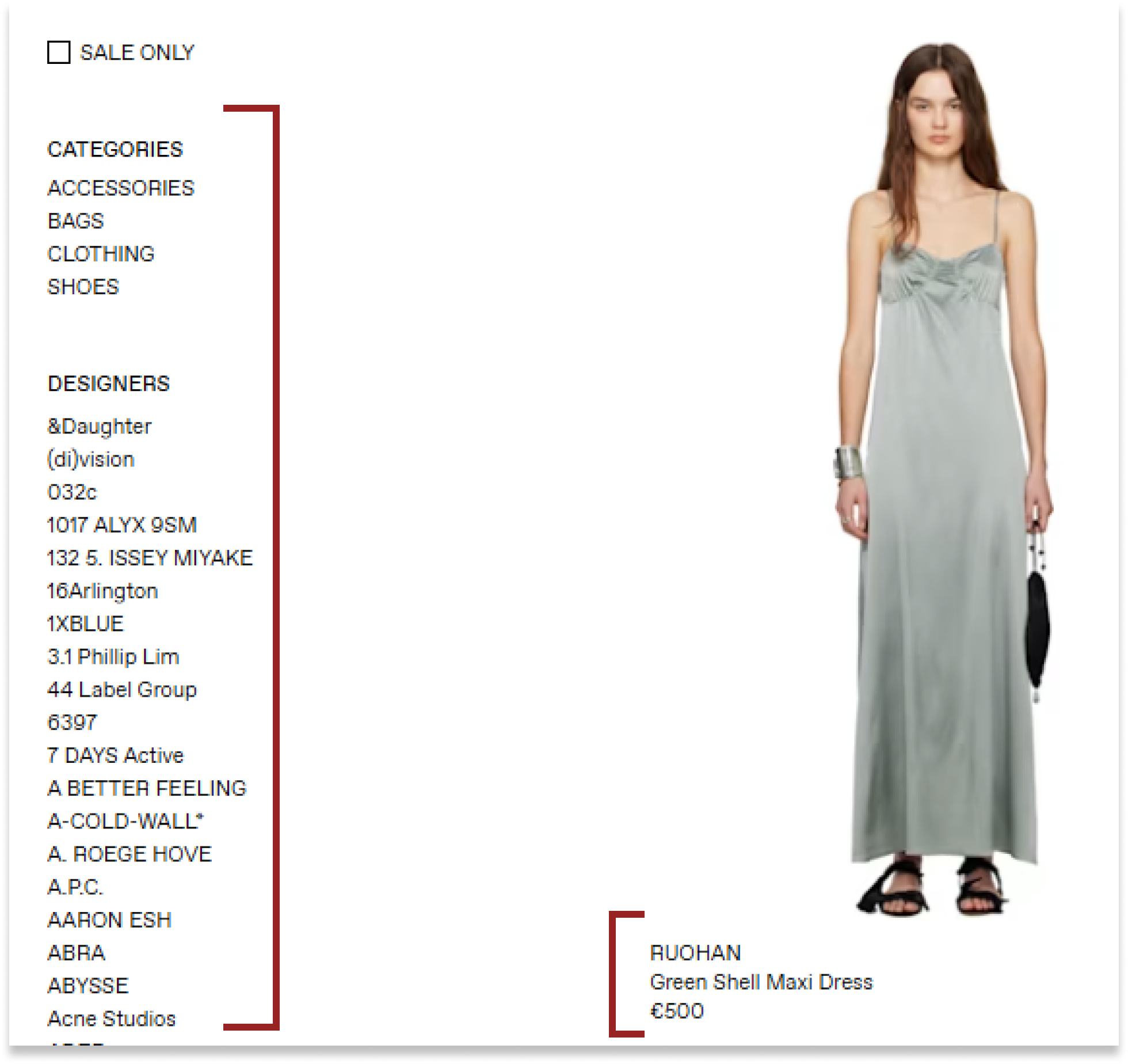
SSENSE - "The filters on the side are too small and inconvenient to use. There's simply too much information to process."
SSENSE - “The homepage seems too cluttered… I’m not sure where I can find the clothing items”
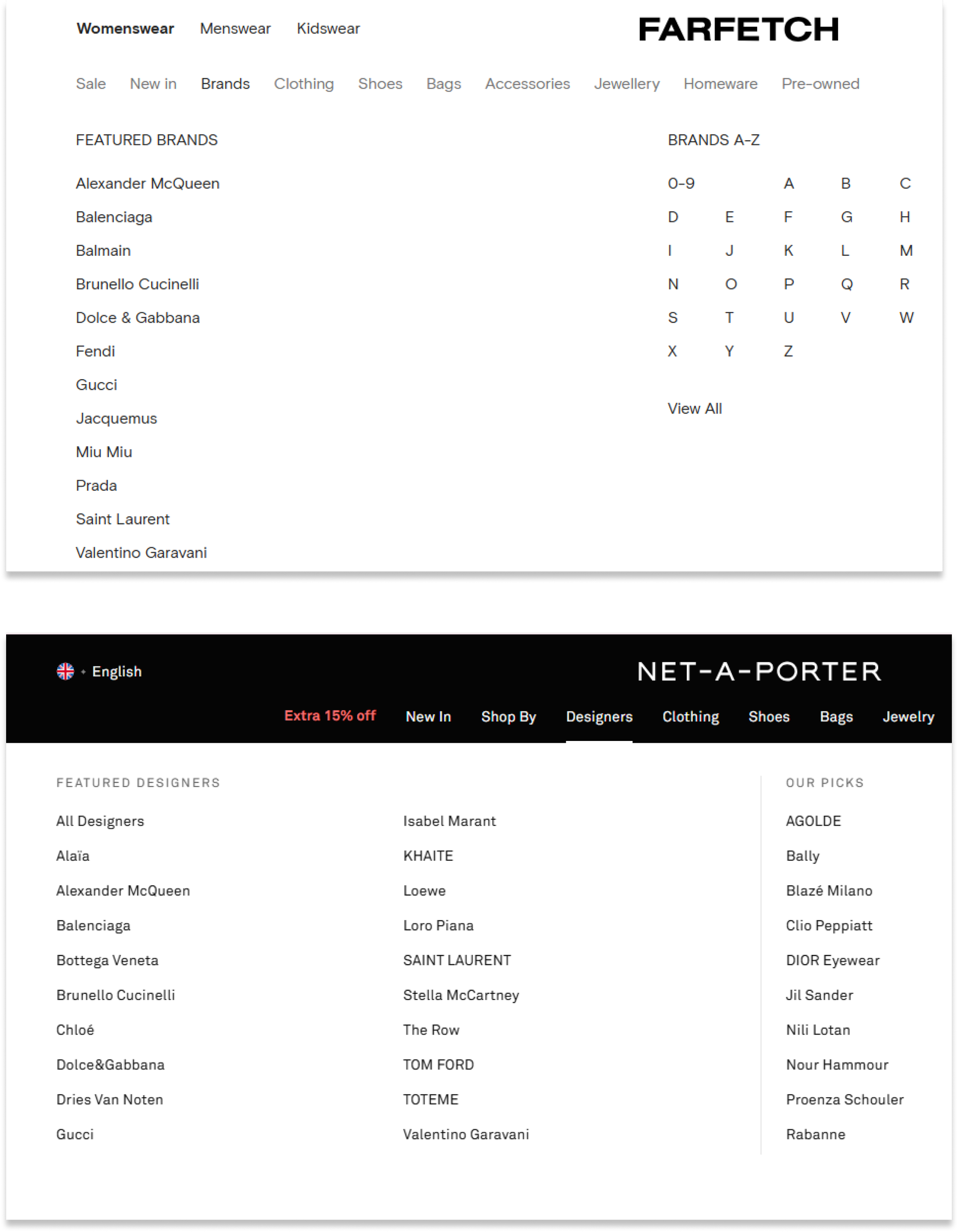
Farfetch - "The dropdown menu in the navigation bar made it much easier to locate and browse for a dress."
Net-a-porter - "Finding a dress on the website was much easier and more straightforward."
Insights on SSENSE:
1) Users experienced information overload, making it difficult to filter through brands effectively.
2) The text size was too small, causing readability issues for users.
Insights on Farfetch & Net-a-Porter
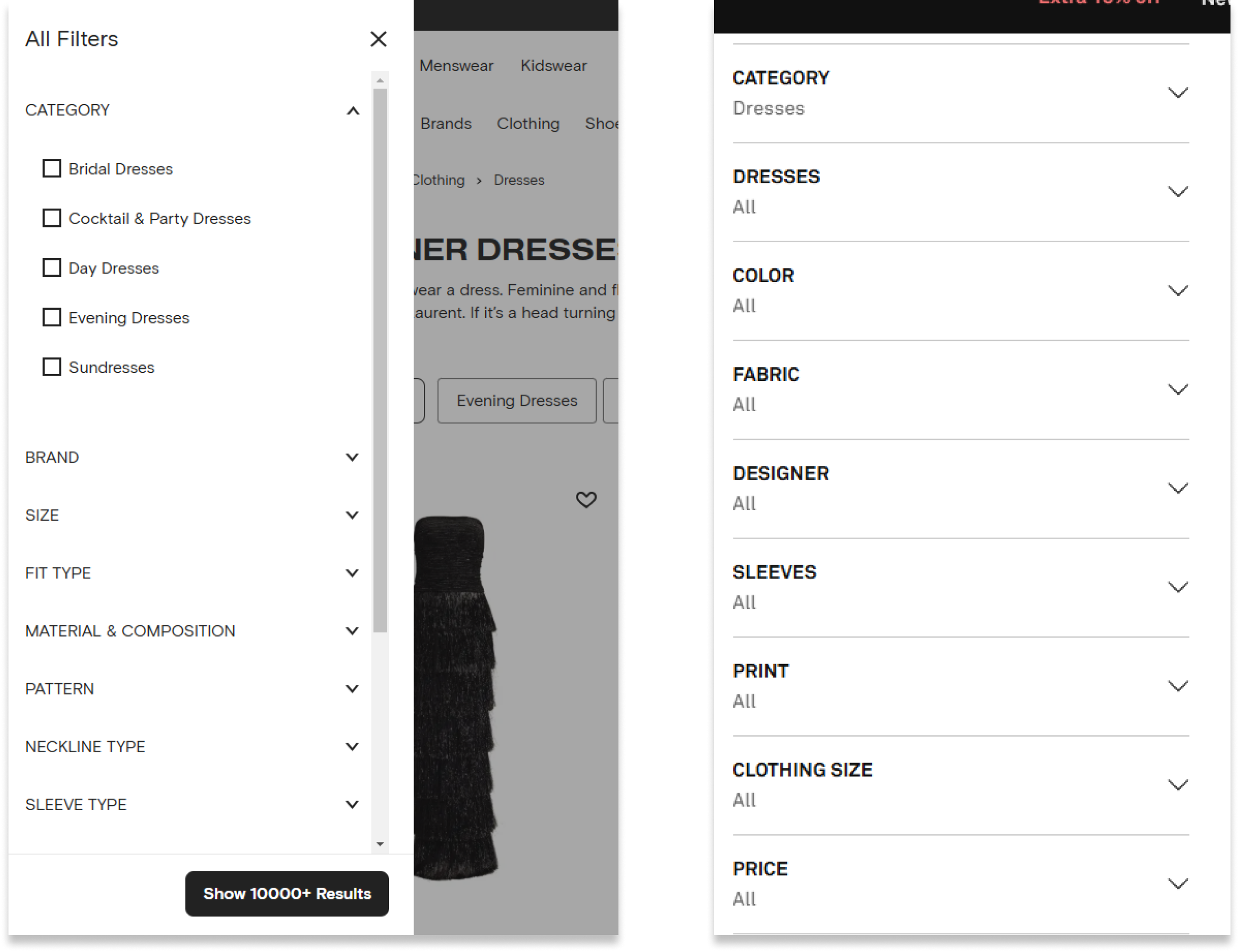
1) Users navigated the filters quickly, finding them easier and more intuitive to use.
3) It took significantly longer to locate the colour filter compared to the competitors website.
2) Brands were easier to spot and identify, enhancing the browsing experience.
3) The text size was appropriately designed, with users commenting on its clear readability.
EMPHATISE
After conducting in-depth user research on the SSENSE website, I created an affinity map to analyse user behaviour and thought patterns. This approach provided valuable insights into their experiences with the site.
Usability Issues
Based on quantitative and qualitative findings, I identified five key issues affecting all participants:
Persona
During our customer research, we discovered that SSENSE serves a diverse audience ranging from 18 to 40 years old. To gain deeper insights into their needs and motivations, I created a detailed user persona to better represent and understand the user.
Customer Journey Map
I created a customer journey map based on Lisa’s persona, pain points, and insights gathered from the usability test. This map details her experience with the current version of the SSENSE website, from her initial search on a retail platform to browsing and making a purchase.
From this map, it’s clear that Lisa’s biggest frustration comes when she’s browsing the site and trying to filter her options. The cluttered filtering system makes it hard for her to find what she’s looking for, turning what should be a fun shopping experience into a frustrating and time-consuming task.
IDEATION
User Flow
Drawing from the insights gained from the affinity map and customer journey map, I created a user flow to further understand user behaviors and thought processes. This visual tool allowed me to outline the key steps and interactions users experience while navigating the website.
Problem Statement
How Might We?
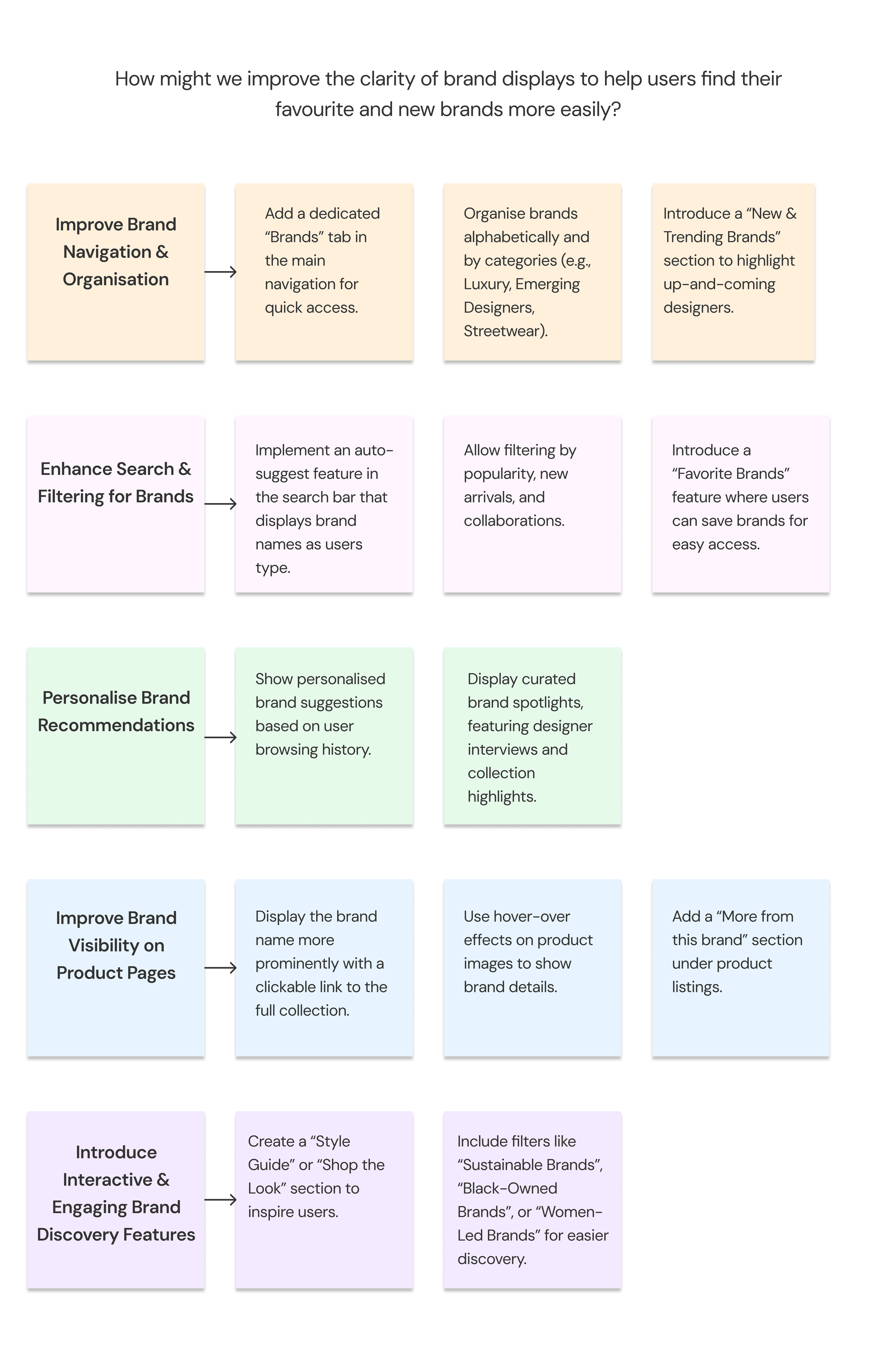
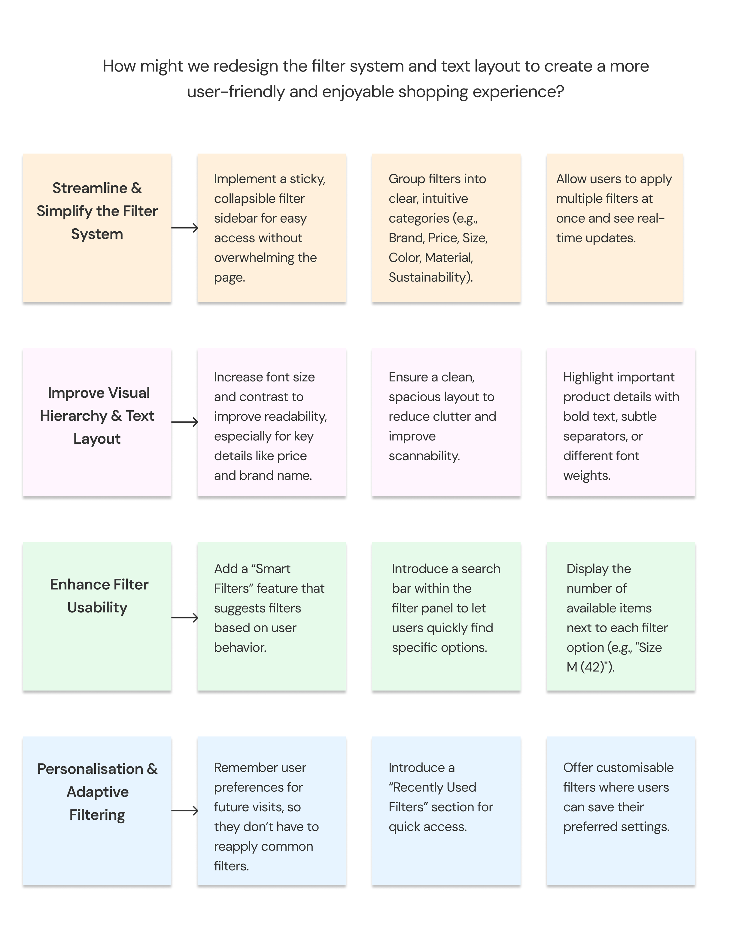
After identifying key pain points through usability tests and user interviews, I crafted a problem statement that clearly defines the challenges users face on the SSENSE website. This statement highlights the main usability issues, such as navigation difficulties, ineffective filtering, and lack of guidance, providing a clear foundation for improving the user experience.
“The SSENSE website faces key usability issues. The filter system is overwhelming, making it hard for users to navigate and discover brands. The homepage lacks a clear information hierarchy, causing confusion about its purpose. Additionally, small text and cluttered layouts reduce accessibility, frustrating users and impacting their shopping experience. ”
Before creating my prototype, I brainstormed three HMW questions to guide my solution-finding process. These questions help reframe the challenges and spark creative ideas for improving the user experience.

IDEATION
Lo-Fi Prototypes
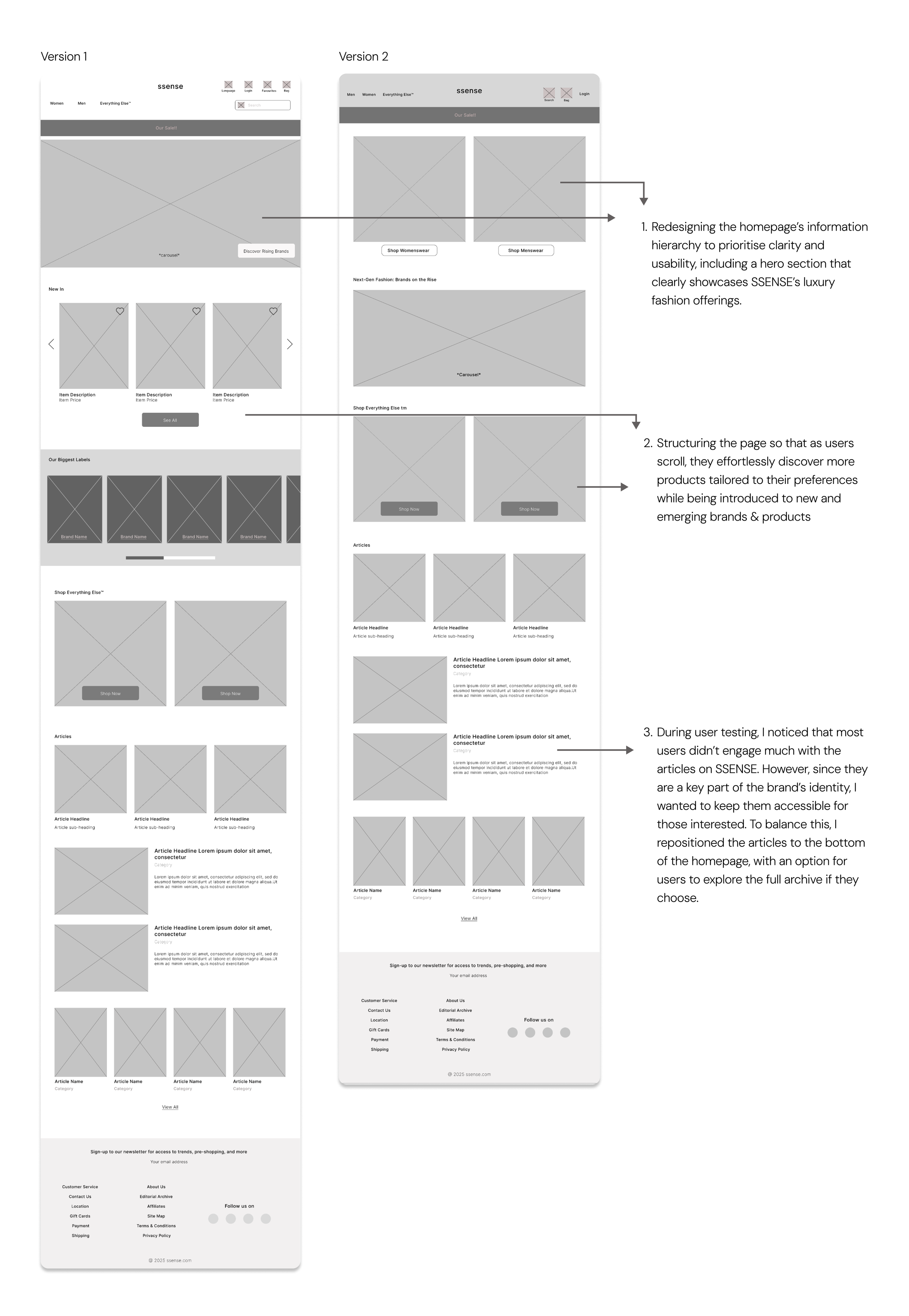
Homepage
Womenswear Landing Page
Advanced Filter
A/B Testing on the Filters
Shopping Basket
Implementing a collapsible side panel for filters, allowing users to expand it for more options and easily scroll through selections for a smoother browsing experience.
After designing two distinct filters for the website, I conducted an A/B test with 10 users to evaluate their performance. The primary goal was to identify which filter users found easier and more convenient to use. To determine the winner, I evaluated ease of use by measuring user satisfaction and error rate.
During my A/B test, I asked users to evaluate the product page and locate the filter. They were free to choose what they wanted to filter, allowing them to interact with the page naturally and authentically.
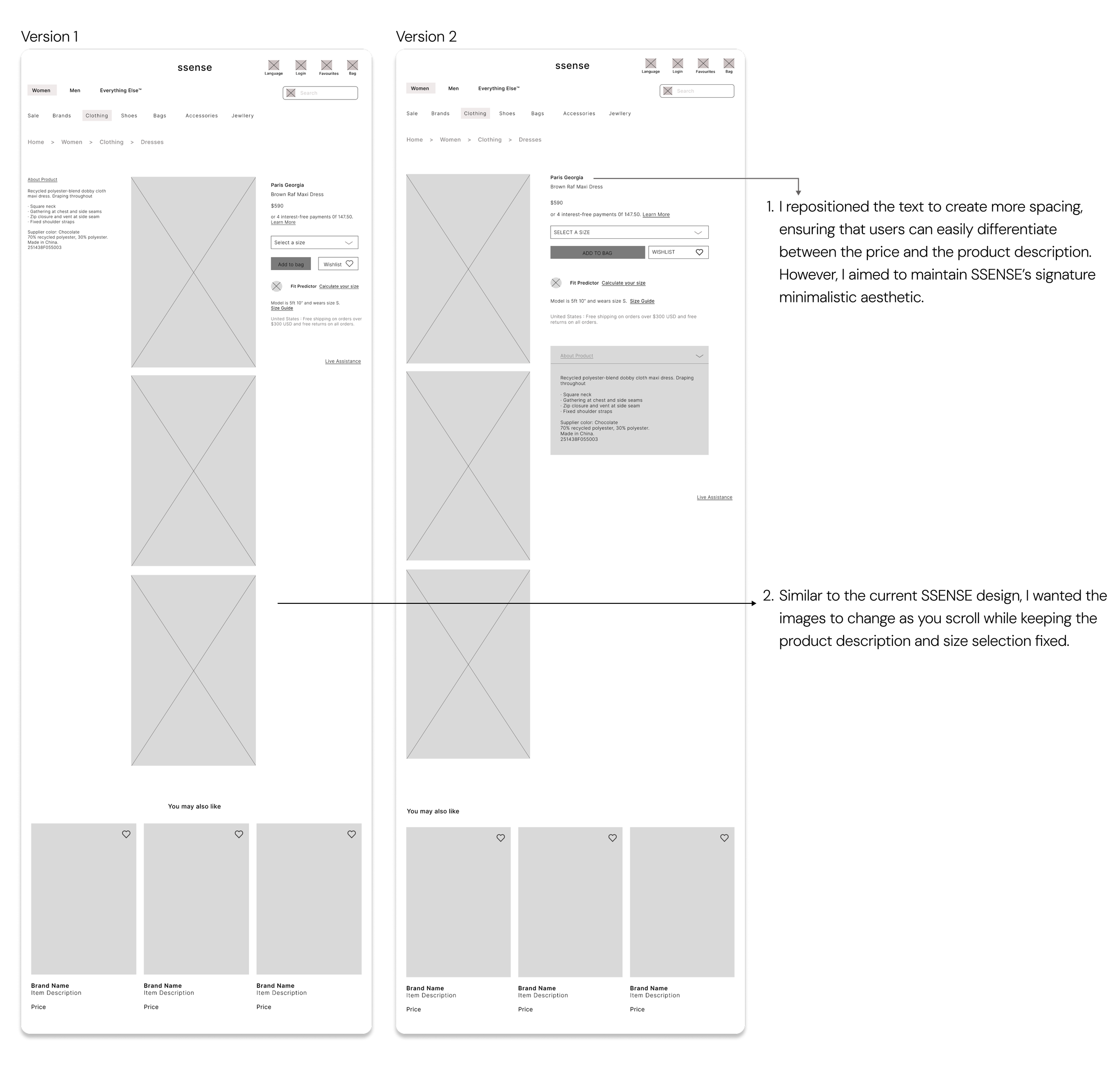
Product Page
User Quotes:
“Filter A was much easier for me to use. I prefer having the options laid out right in front of me rather than having to click on another tab.”
“Filter B was okay, but expanding each option took too long and felt tiring. I liked the idea of Filter A.”
“Filter A made it easier for me to see all the options.”
Users responded more positively to Filter A, with the majority expressing a preference for it. Based on this feedback, I will further refine and incorporate this concept into my final design.
BEFORE & AFTER COMPARISON
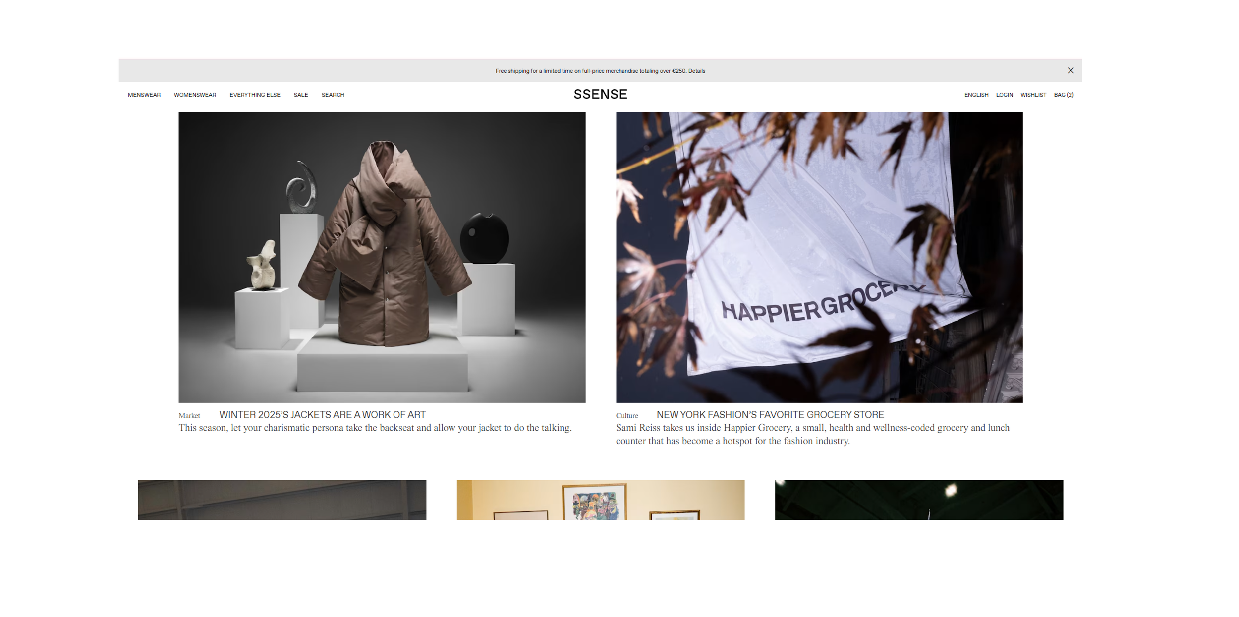
Homepage Before
Homepage After
The homepage lacked clear direction, so I designed separate homepages for different categories—Womenswear, Menswear, and Everything Else. This personalised approach creates a more inclusive experience, allowing users to easily navigate and discover the full range of products.
Navigation Bar Before
Navigation Bar After
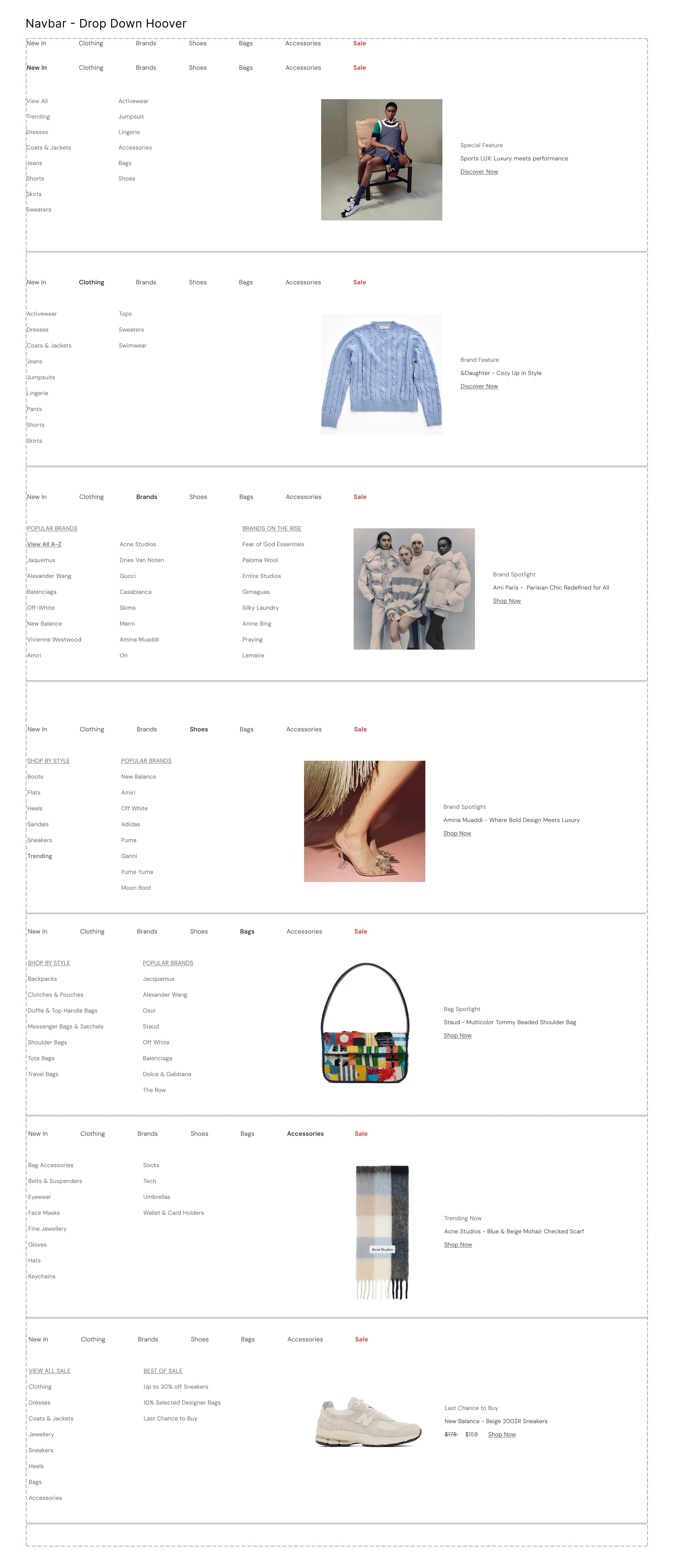
The current website lacked a detailed menu, making it difficult for users to find what they needed. Introducing a drop-down menu provides clear navigation, ensuring users can easily explore everything SSENSE has to offer while enhancing accessibility.
Products Page & Filter Before
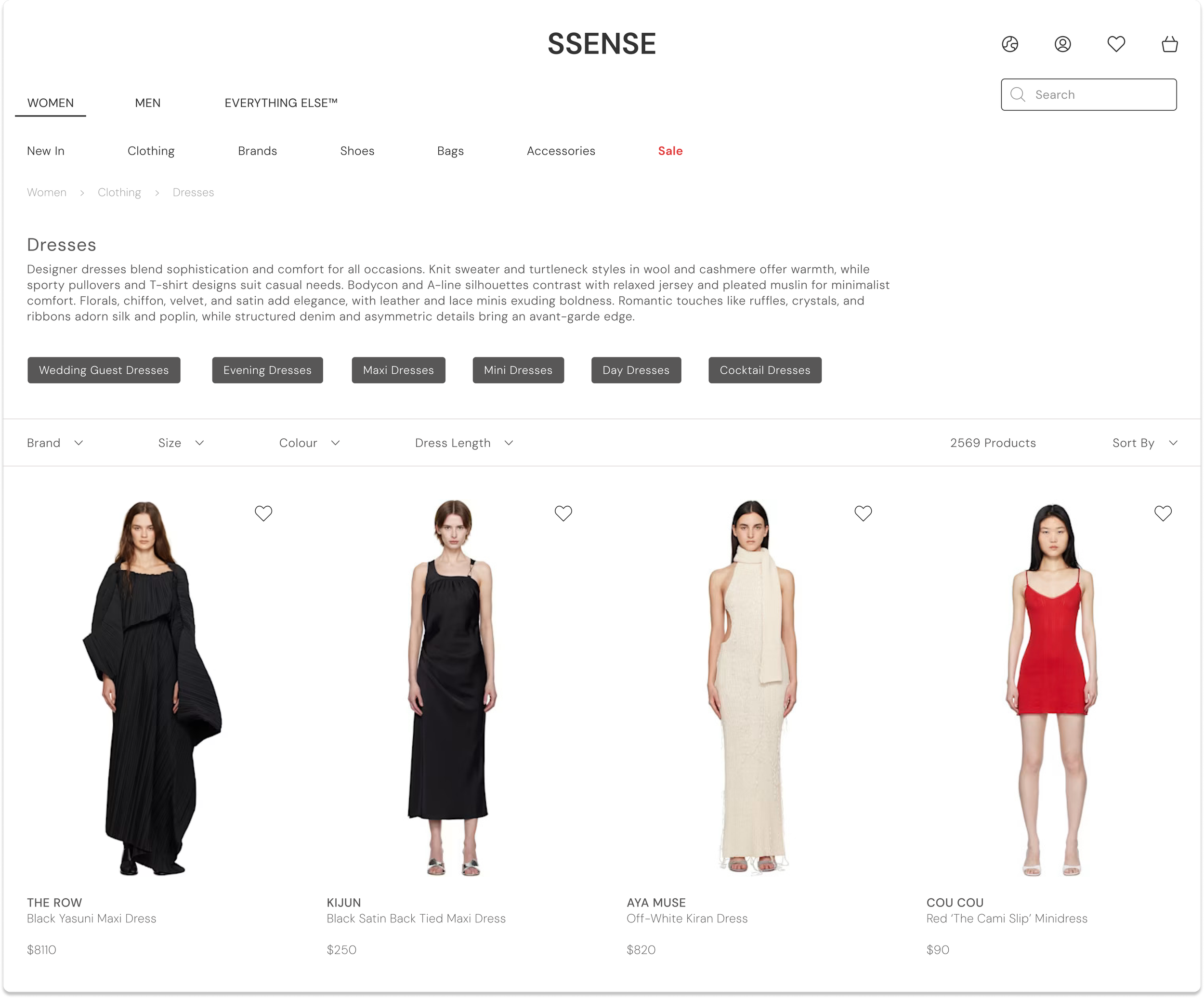
Products Page & Filter After
Placing the filters horizontally allows more options to be displayed in a cleaner, more user-friendly way. In the current SSENSE design, the long list on the left side can cause cognitive overload. To enhance usability, I also increased the text size and made the price more prominent for better visibility.
Add to Basket Before
Add to Basket After
I really liked SSENSE's minimalistic design and wanted to preserve that aesthetic while making a few adjustments to improve accessibility.
I increased the text size and reorganized the information hierarchy to make key details, such as pricing, easier for users to spot.
Shopping Basket Before
Shopping Basket After
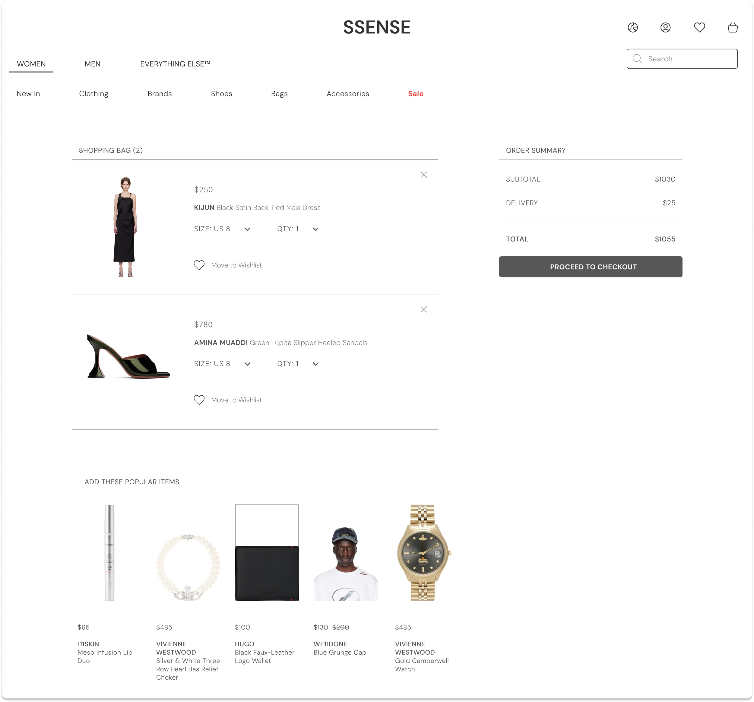
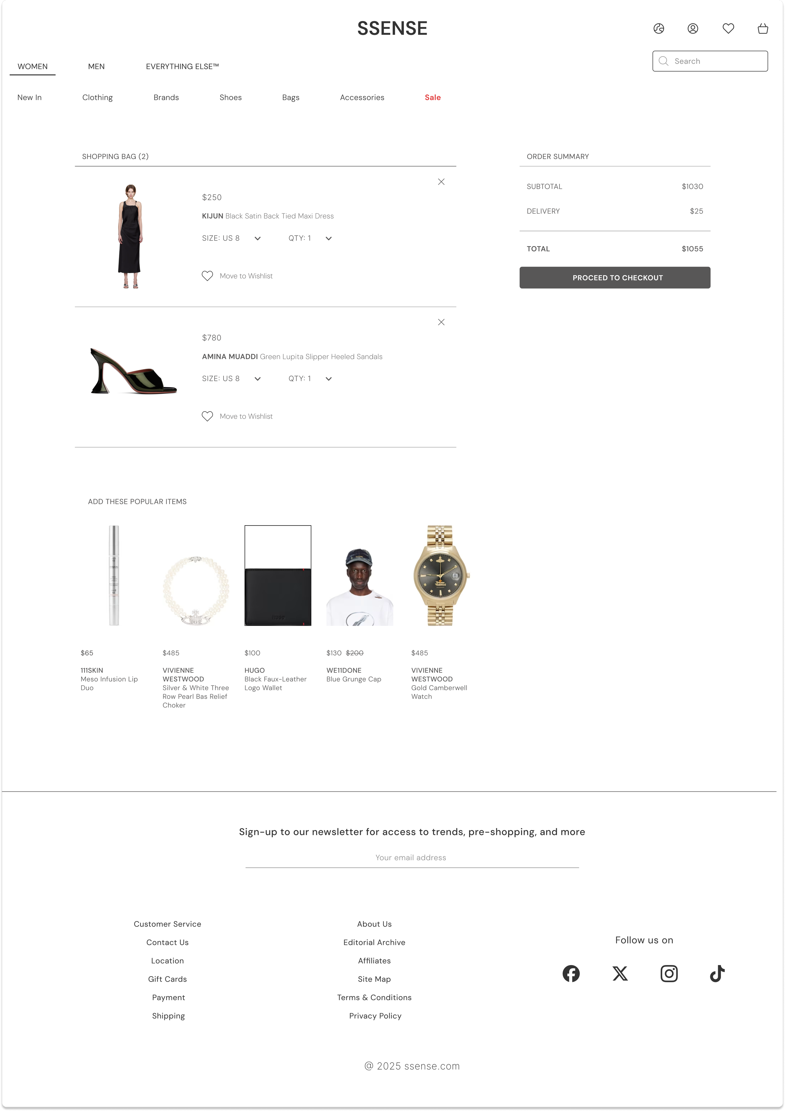
I wanted to maintain a clean aesthetic similar to the current version of the website while making a few improvements. These included adding a summary section on the right-hand side with a clear price breakdown, increasing the text size, and creating more spacing between images to reduce clutter.
Womenswear Landing Page
FINAL WIREFRAMES
Drop Down Menu
Products Page
Add to Basket
Shopping Bag
Menswear Landing Page
Womenswear Filter
Product Scroll
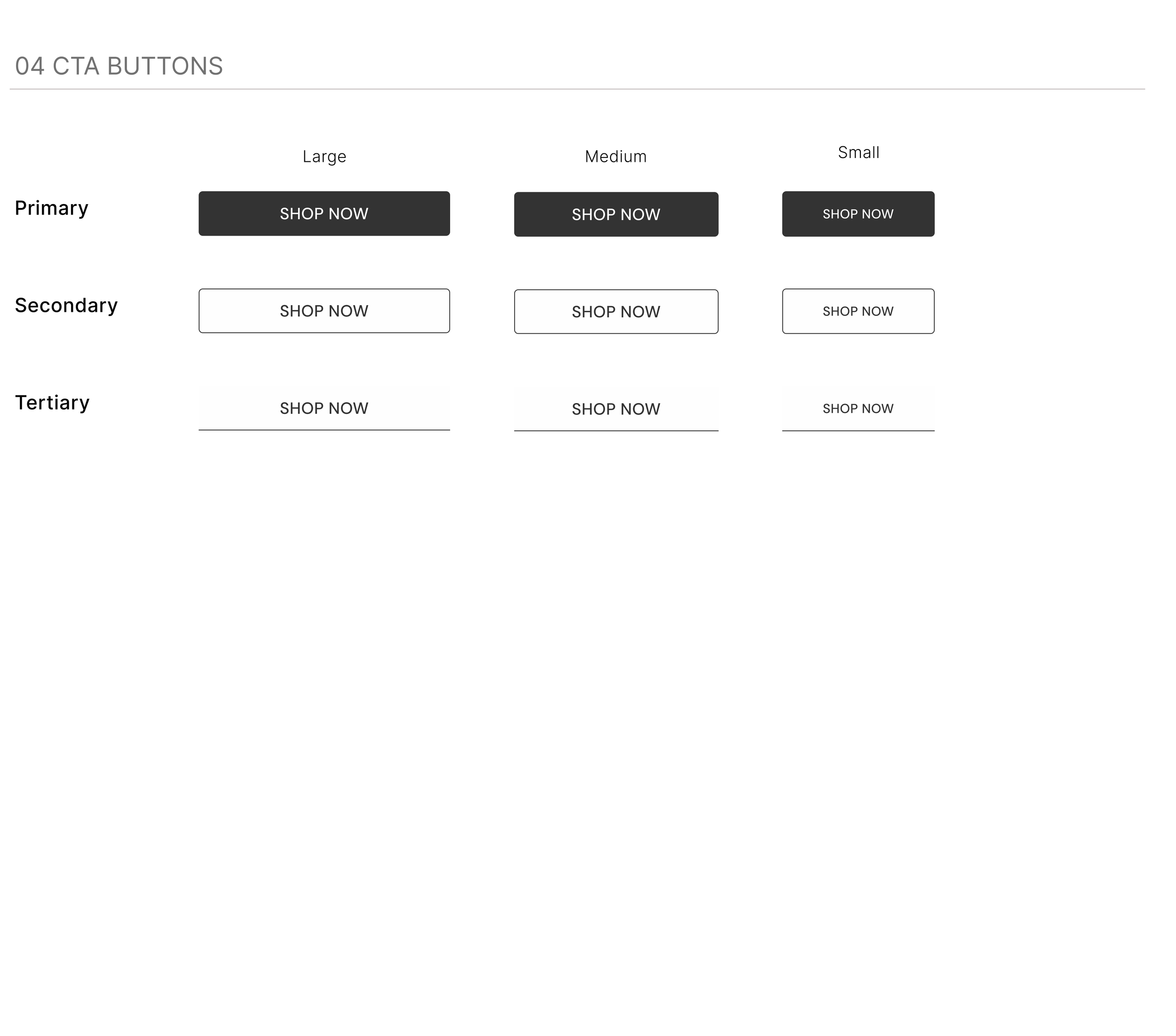
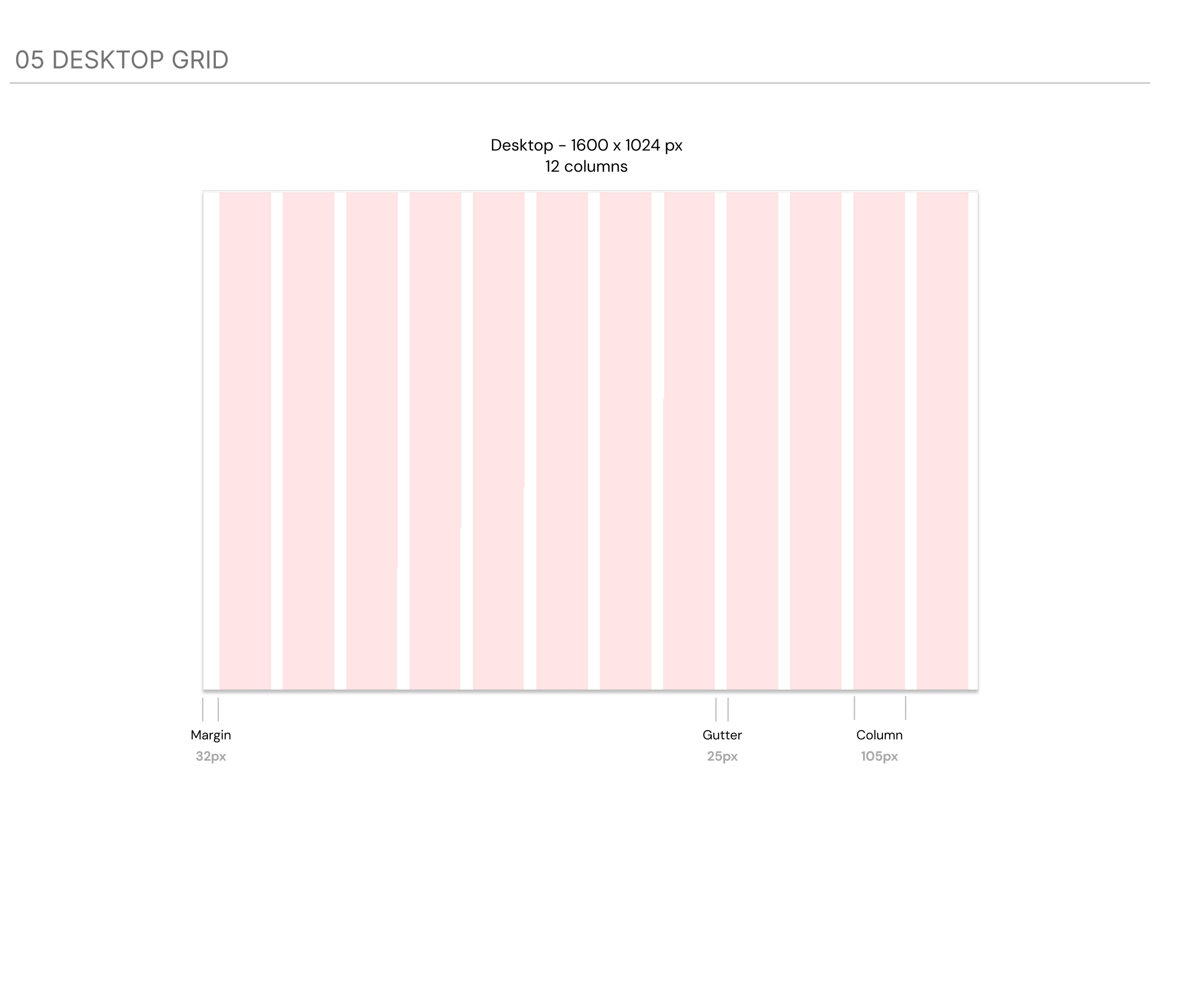
DESIGN SYSTEM
My Goal:
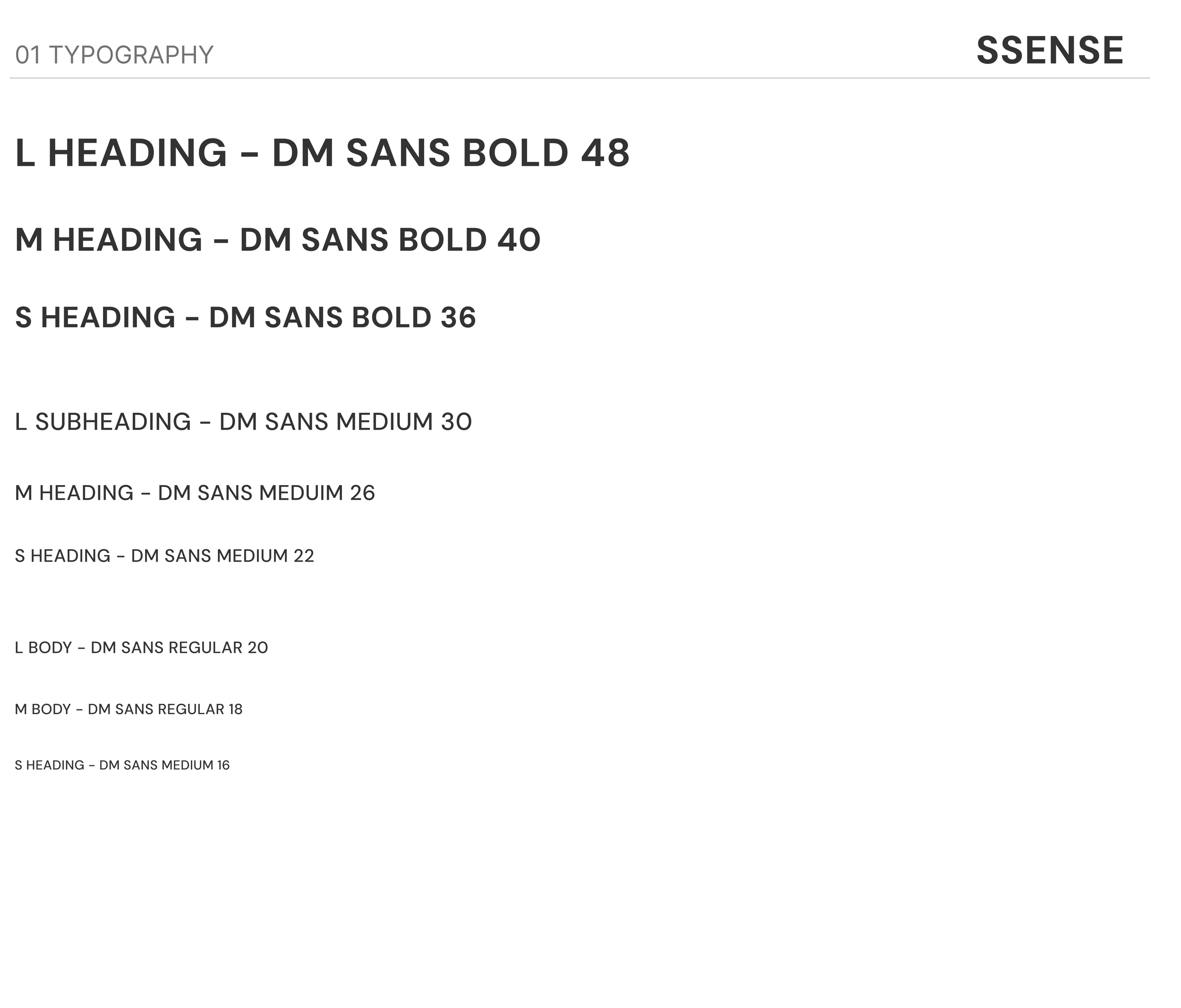
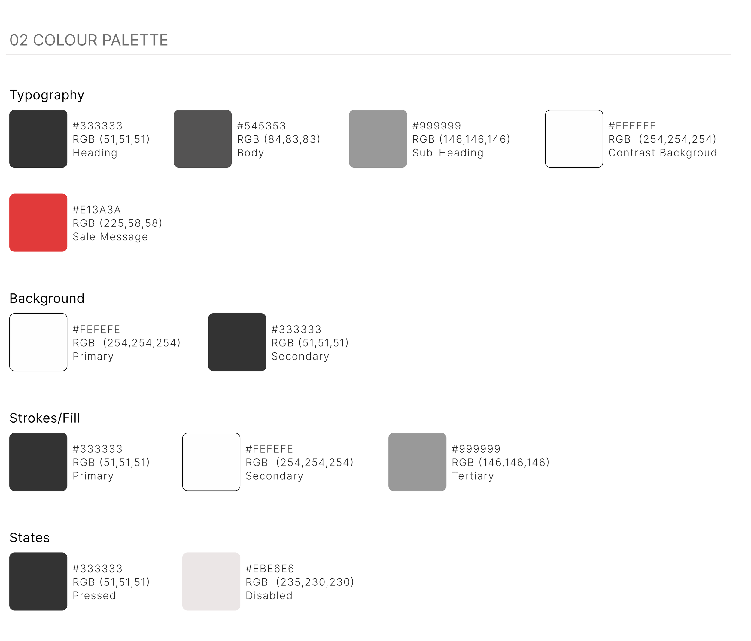
I focused on maintaining SSENSE’s strong brand identity while refining the design, ensuring that my adjustments aligned effortlessly with its signature minimalistic aesthetic.
USER TESTING
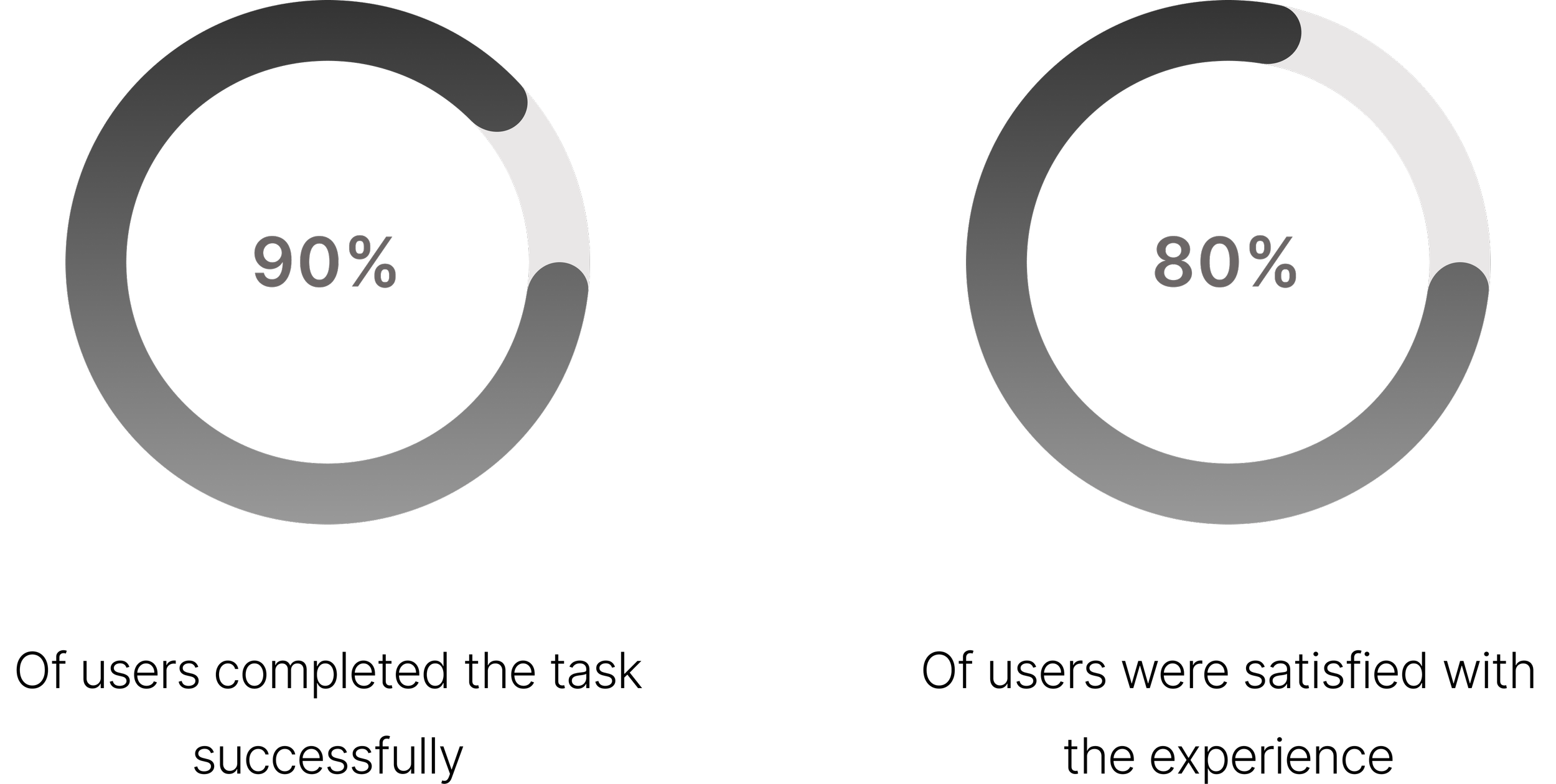
Finally, I tested my version with 10 users to gather feedback on potential areas for improvement. The results were largely positive, with valuable insights for further refinement.
Main Tasks:
During my usability test, I focused on three key aspects:
Results & Feedback
Next Steps
"The new design feels so much cleaner than the last version - I can instantly understand what the website is about."
“The photos were not as clear but the overall website was easy to use”
“I could see myself using this website, the navigation was clear and intuitive”
Overall, while the website has made significant improvements, there are still areas that need refinement. User feedback highlighted the need for clearer filters, a more engaging homepage for those unsure of what they’re looking for, and the development of the 'Everything Else' page to showcase offerings effectively. By addressing these areas, the website can provide a more intuitive and enjoyable shopping experience.
My Reflection
The Power of Simplicity
Throughout this project, I realised that simplicity in design is often more effective than adding unnecessary complexity. A clean, straightforward layout can enhance accessibility and usability. My goal was to maintain the brand's minimalist aesthetic, but at first, I struggled because the changes felt too subtle. However, as I made micro-adjustments, I saw how these small refinements significantly improved the overall user experience.
Moving forward, I’ll embrace this philosophy, ensuring that I prioritise clarity and usability without overcomplicating the design process.


